
The Best Green Paint Colors for Every Style of Living Room
What if one color could make your living room feel better? Green paint colors do just that. They make your room feel sophisticated, calm, and stylish.
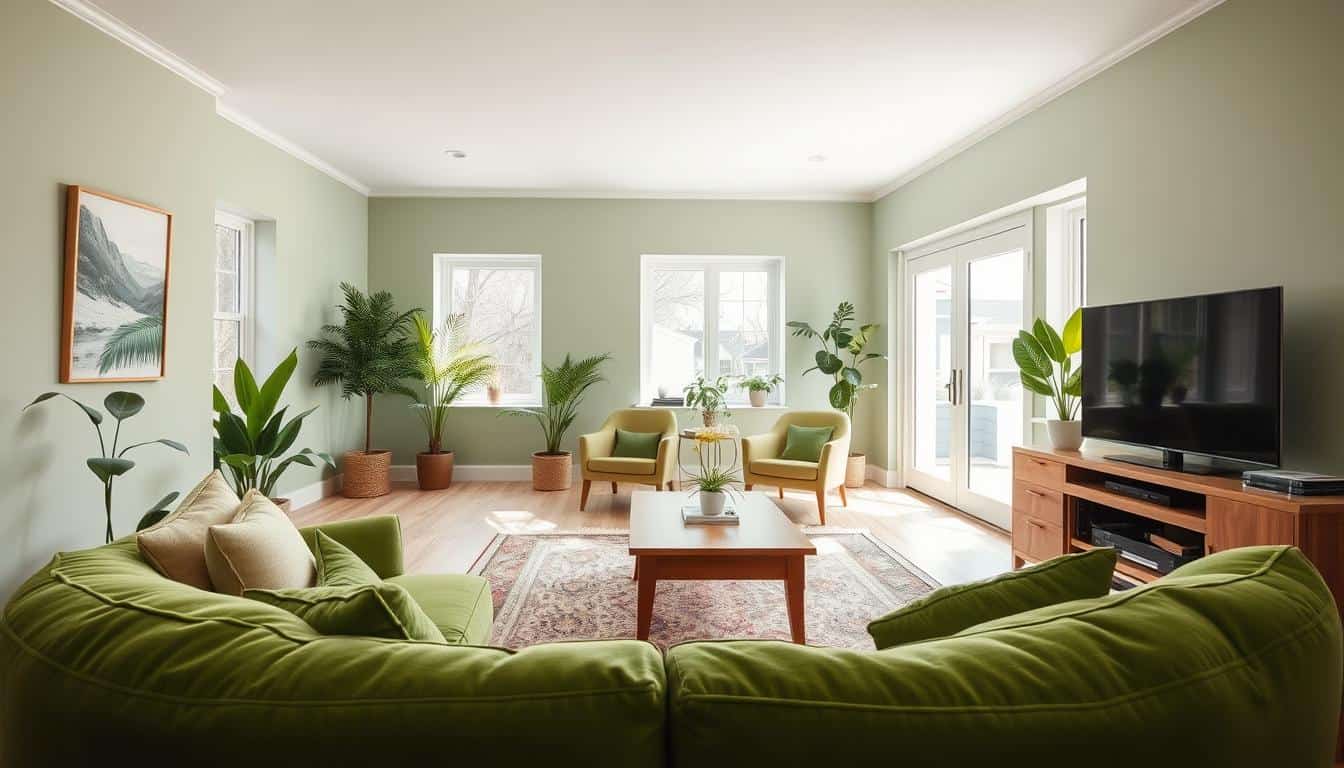
Green is special because it matches every design style. It works for minimalist chic or cozy farmhouse looks. Muted sage whispers calmness, while bold emerald shows confidence.
Green’s psychology is interesting. It brings nature inside, making spaces feel grounding and lively. Soft mint looks great with stunning color combinations. Deep forest tones ground a room, and there are many options.
This guide is special because it uses real-world experience. It uses Light Reflective Values (LRV) for smart choices. No guessing — just top green paint colors that work.
Key Takeaways
- Green works seamlessly with every interior design style from modern to traditional
- Nature-inspired hues provide psychological benefits including calm and energy
- Shade selection ranges from soft sage to bold emerald for different personalities
- Light Reflective Values (LRV) help you choose based on your room’s lighting
- Green pairs beautifully with multiple color combinations for versatile decorating
- Personal experience and real-world testing ensure practical, livable results
Why Choose Green for Your Living Room?
Choosing green for your living room is more than a trend. It makes your space calm and connects you to nature. Green fits many design styles, from modern green paint colors to traditional shades.
Green is like nature’s neutral. It feels safe and peaceful to our brains. Unlike bold colors, green balances without overwhelming us.
The Psychological Benefits of Green
Science shows green lowers stress. Being in a green room makes you feel better. Green is the color of growth and renewal.
Our eyes find green easy to look at. This means less eye strain and more comfort. Popular green hues make us feel relaxed and open.
Studies show green environments:
- Lower blood pressure and heart rate
- Improve focus and concentration
- Reduce anxiety and promote calmness
- Enhance creativity and problem-solving
Versatility Across Different Styles
Green fits any design style. Cool-toned greens are great for modern spaces. They bring a spa-like feel.
Warm olive greens add earthy sophistication to traditional rooms. They look good with antique furniture. For drama, dark green bedrooms are stunning.
Green is a smart choice. It works as:
- Statement walls in neutral rooms
- Calming backdrops for bold furniture
- Accent colors through accessories
- Full room coverage for immersive experiences
Unlike trendy colors, green stays popular for centuries. It’s a timeless choice.
Green looks great with both natural and artificial light. Morning sun makes it fresh, while evening lamps add warmth. It’s perfect for rooms used all day.
Popular Green Shades to Consider
From earthy olives to fresh mints, these green shades make living rooms special. They are traditional green paint shades that have won many hearts. Each shade adds its own charm to your walls, keeping things timeless.
These colors are loved for their lasting appeal. They look great in any light and match many decor styles. Let’s explore the green paint hall of fame.

Olive Green: Timeless and Earthy
Olive green brings sophisticated warmth to your room. It’s like a cozy cashmere blanket. It’s both luxurious and easy to love.
Renwick Olive SW 2815 is a top choice for this shade. It connects you to nature’s calm moments. It adds elegance that never fades.
This color looks great with warm woods and brass. It adds depth and richness. Your guests will see the elegance right away.
Mint Green: Fresh and Inviting
Mint green is like a friendly face that welcomes everyone. It brings lightness and energy without being too much.
Benjamin Moore Antique Jade (LRV: 54) shows off this color’s versatility. It changes from gray to green-blue with the light. It’s perfect for rooms with changing light.
Mint green is a top pick for trendy green color palettes. It goes well with many colors, giving you lots of decorating options.
Forest Green: Rich and Cozy
Forest green grabs attention in a good way. It adds coziness and makes a bold statement.
Two top picks are:
- Clare Paint Current Mood (LRV: 16) — has rich, complex undertones
- Sherwin Williams Evergreens (LRV: 8) — has deep, moody sophistication
- Both are great for focal walls
- Perfect for rooms with high ceilings or lots of natural light
These deeper shades are great for showing off in big rooms. They don’t make rooms feel dark. Instead, they create a cozy feel everyone loves.
Green for Modern and Contemporary Designs
Green paint makes modern spaces feel natural and stylish. It adds warmth without messing up clean lines. This choice brings together sophistication and comfort in one color.
Modern design loves green for its life-giving quality. The right shades enhance sleek furniture and details. Versatile green tones can be subtle or bold, depending on your space.

Soft Sage: Minimalist Appeal
Soft sage is great for modern spaces. It’s elegant but doesn’t fight with bold furniture. Sherwin Williams Liveable Green is a top pick, with an LRV of 61.
This high LRV keeps rooms bright and airy. It’s perfect for:
- Gallery walls with modern artwork
- Open-concept living areas
- Rooms with plenty of natural light
- Spaces with mid-century modern furniture
Sage is calm yet sophisticated. It’s perfect for rooms needing a touch of elegance.
Vibrant Emerald: Add a Pop of Color
Want to make a bold statement? Vibrant emerald is the way to go. Benjamin Moore Palace Green is a deep, rich choice with an LRV of 24.
This bold color is great as an accent wall. It works well behind fireplaces or in minimalist dining areas. The key is to balance it with simplicity.
Your sleek furniture will look amazing against these colors. The contrast adds interest without overwhelming your space.
Incorporating Green in Traditional Spaces
Green paint is great for traditional interiors. It adds a fresh touch to classic furniture and woods. Traditional spaces and green go well together.
Green paint adds depth to rooms without taking over. Pick shades that match your decor. Think about crown molding and antique furniture.

Classic Hunter Green: A Regal Touch
Hunter green makes traditional living rooms feel grand. It’s like stepping into a historic mansion.
Benjamin Moore Colonial Verdigris is a great choice. It’s dark and adds depth to parlor spaces. It looks good with brass and rugs.
This shade pairs well with mahogany and gold frames. Hunter green is great behind a fireplace or in a dining area.
Moss Green: Subtle Elegance
Moss green is a softer choice for traditional colors. It’s elegant but not too bold. It’s approachable elegance.
Benjamin Moore Trailing Vines shows this beauty. It’s light but deep enough for family spaces. It looks good with wallpaper.
Farrow & Ball Breakfast Room Green is another good choice. It’s cheerful and works well in low-light rooms. It looks good with white trim and classic furniture.
Moss green is like a supporting actor in your design. It makes other things look better. It pairs well with cream, wood, and traditional fabrics.
Coastal Living Room Ideas with Green
Green paint colors remind us of the ocean’s beauty. They turn your living room into a seaside haven. Coastal green shades bring a vacation vibe to your home.
Choosing greens that match the sea’s moods is key. Soft seafoam to deep teal creates a perfect coastal look.

Seafoam Green: Light and Breezy
Seafoam green brings the ocean inside with its light, ethereal quality. Benjamin Moore North Shore Green has an LRV of 71. It makes small spaces feel big and calm.
This shade looks great with white trim and natural textures. Imagine your space filled with weathered wood and beachy decor. Seafoam green is perfect with coastal bedding for a relaxed vibe.
Seafoam is versatile. It’s fancy for formal areas and laid-back for daily use. It invites you to relax with a book.
Teal: A Splash of the Ocean
Teal adds sophistication to coastal design. It captures the ocean’s depth without overwhelming your room. This rich hue adds drama without being too much.
Sherwin Williams Sea Salt shows how green with gray undertones can feel like a cloudy beach day. With an LRV of 63, it brings a relaxed beachy feel to bedrooms too.
Teal looks amazing with weathered wood and nautical items. The gray undertones add class while keeping the coastal feel. Natural light makes teal’s colors pop.
These coastal green options show you can have the beach at home. Just pick the right paint color, and your living room becomes a seaside getaway.
Pairing Green with Other Colors
Choosing the right colors for your green living room makes it amazing. Green paint is like magic, making other colors pop. It’s all about finding the right mix for the mood and style you want.
Your green walls open up a world of possibilities. You can go for calm or bold, depending on the colors you pick. These choices set the mood of your space.

Neutrals: Balancing Act
Neutrals are perfect with green walls. Crisp whites, warm creams, and soft grays let green shine while keeping things calm. This mix avoids feeling too much.
It’s important to match undertones. Warm green goes with cream or mushroom gray. Cool greens pair well with crisp whites and cool grays.
Think of neutrals as a safety net. They make bold green choices feel more grounded. This is great for trying out olive green bedroom ideas without going too far.
Bold Colors: Creative Combinations
Want to add some excitement? Green loves bold colors. Deep forest greens and rich burgundy are stunning. Sage greens and blush pink or coral are magical.
Navy blue and green are classy. These combos show green works with many colors. Pick one color to be the main focus and use the other as an accent.
Use the 60-30-10 rule for balance. 60% green walls, 30% secondary color, and 10% accent. This keeps your room from feeling too busy.
Don’t be scared to try new things. Green is very forgiving. Start with small things like pillows or artwork to find your new favorite look.
Green Paint Finishes: What You Need to Know
Paint finish is key to a great green living room. It affects how easy your walls are to clean and how bright your green paint looks.
Your green paint looks different with each finish. It’s not just about looks. It’s about how it works in your home, handles daily use, and looks in different lights.

Matte vs. Gloss: Choosing the Right Finish
Matte finishes give a sophisticated, velvety look that hides wall flaws. They’re great for formal rooms where you want your green to feel rich. Deep forest green or elegant sage looks stunning in matte.
But, matte finishes are hard to clean. Avoid them if you have kids or pets that mark walls.
Gloss finishes are workhorses of the paint world. They make your green look brighter and rooms feel bigger. Semi-gloss or satin finishes are durable and easy to clean, perfect for busy rooms.
Think about your lifestyle when choosing. Need walls that can handle marks? Choose higher gloss. Want a museum-quality look? Matte is the way to go.
Sheen and Light Reflection
The sheen of green paint is crucial because it changes how the color looks in different lights. Higher sheen makes green look more vibrant and can make lighter greens feel fresh.
Lower sheen makes deeper greens feel cozy and sophisticated. Olive green looks different in matte versus semi-gloss. Matte feels earthy, while semi-gloss is lively.
Think about your room’s light when picking sheen levels. North-facing rooms need higher sheen to reflect light. South-facing rooms can handle lower sheen.
Light Reflective Value (LRV) is key with green paint. Lighter greens with higher LRV values change a lot between matte and gloss. Test your green in different sheens before you decide. You might be surprised at the difference.
Tips for Choosing the Right Shade of Green
Finding the right green paint is all about knowing your room. Every room has its own lighting issues. Getting this right can make a big difference.
Choosing green paint is like finding a partner. You need to spend time together before deciding. Many factors affect the perfect green for your space.

Consider Natural Lighting
Natural light is key for your green paint. North-facing rooms have cool, steady light. This can make warm greens look bad but cool greens look great.
South-facing rooms get warm light that makes greens look amazing. But, very bright greens might be too much with all that sun.
East and west-facing rooms are tricky. The light changes a lot. Check LRV numbers for these rooms. If it’s dark, choose greens with LRV of 60 or higher.
For mid-tone colors, an LRV of 35-65 works well. North-facing rooms need LRV of 60 or higher.
Testing Samples: Paint Swatches
Get paint samples and live with them for a week. This is a must. Paint big swatches on white paper and move them around your room.
Check your samples in morning, afternoon, and evening light. The color will change, showing its true self. Always swatch on white paper or poster board before deciding, as colors look different in different rooms.
Don’t decide based on small paint chips at the store. They’re not helpful. You need big samples in your space with your lighting.
Move your samples around the room all week. See how they look with your furniture and decor. This will help you avoid expensive mistakes.
Maintaining Your Green-Lit Living Room
Your green walls are beautiful. They need care to stay fresh for years. Knowing your paint finish and cleaning habits is key.
Cleaning and Upkeep of Painted Walls
Matte finishes need gentle care. Use a soft cloth and mild cleaner to avoid shiny spots. Semi-gloss and satin finishes can handle tougher cleaning.
Keep touch-up paint ready for scuffs and dings. When touching up, blend the paint well with the existing color. Store your paint info because memory fades.
Refreshing the Space with Accessories
Refreshing your room doesn’t mean repainting. Change throw pillows, rotate artwork, or add plants. Bold greens work with neutrals, while soft greens can handle bright colors.
For color matching, use tools like Encycolorpedia. Explore green paint ideas for inspiration. Remember, the original formula is best for perfect matches.