

10 Pillow Combinations That Instantly Elevate Your Sofa or Bed
Ready to give your sofa or bed a glow-up without painting a single wall? Pillows are the makeover MVPs—quick, affordable, and wildly satisfying. The right combo can make your space look designer-level in minutes. Let’s build 10 foolproof, mix-and-match pillow recipes you can copy today. Promise: no math degree required, just a good eye and a little play.
1. The High-Low Neutral Stack

Neutrals aren’t boring when you mix textures and sizes. Think of it as quiet luxury for your sofa or bed—subtle, layered, and ridiculously chic.
What to Use
- 24” linen euro shams (for beds) or 22” linen squares (for sofas) in warm beige or greige
- 20” bouclé or chenille squares in cream or ivory
- Lumbar pillow (12×20 or 14×36) in a soft suede or velvet, taupe or mushroom
Why it works: Texture does the heavy lifting when color stays quiet. Linen + bouclé + velvet = depth without visual chaos.
- Use larger inserts than covers (e.g., 22” insert for 20” cover) for that full, plump look.
- Vary warm vs. cool neutrals slightly to avoid looking flat.
2. Color Crush: Monochrome, But Make It Layered
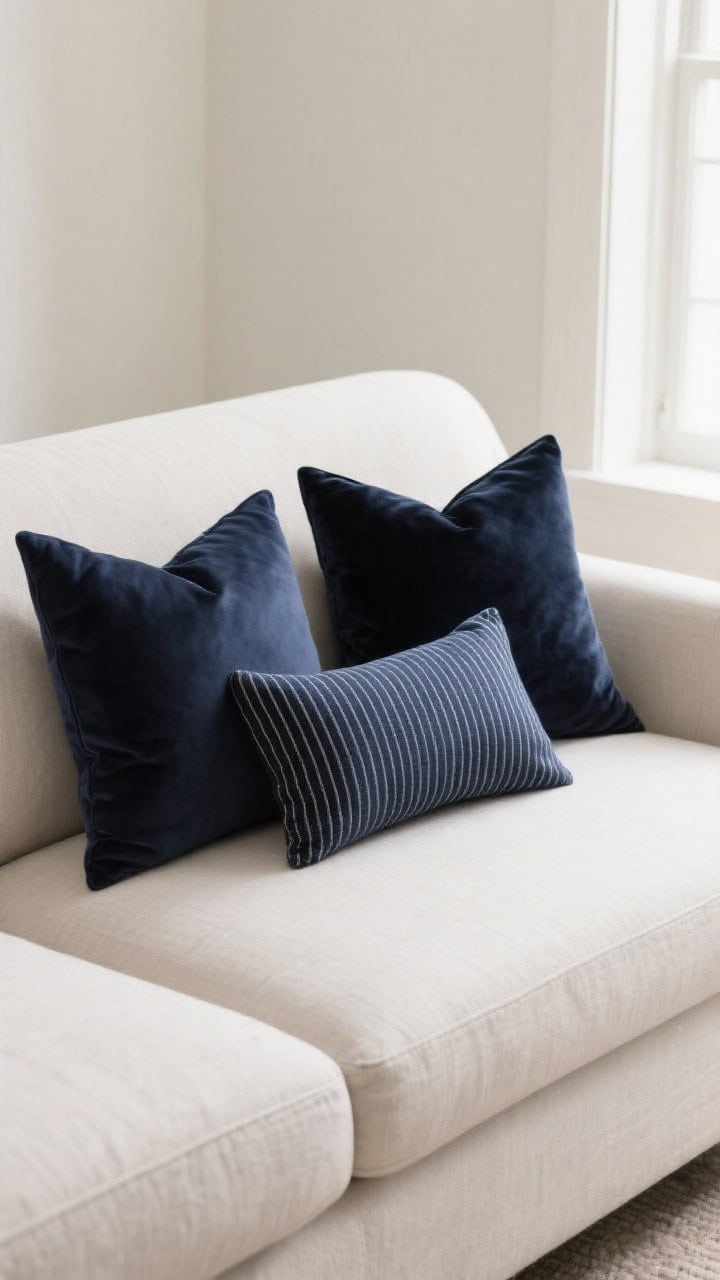
Pick one color and run with it—just change tones, textures, and patterns. Monochrome equals calm, but it doesn’t have to be snoozy.
What to Use
- Two 22” pillows in a rich base color (navy, moss, rust)
- Two 20” pillows in a lighter or deeper tone of the same color
- One patterned lumbar (stripe or abstract) blending two tones of your chosen hue
Pro tip: Mix matte and plush—cotton or linen with velvet or mohair—for a luxe, tonal look.
- Keep patterns simple so the color story leads.
- If your sofa is colorful, go two tones lighter for pillows to keep it chill.
3. Pop of Pattern, Zero Regrets
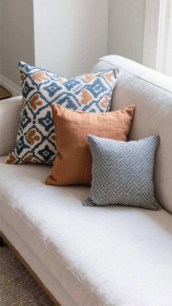
Nervous about patterns? Start small and anchor them with solids. One bold print can do the heavy lifting if you give it backup dancers.
What to Use
- One hero print (floral, ikat, block print) as a 20” or lumbar
- Two solids in colors pulled from the print (22” and 20”)
- One micro-pattern (tiny stripe, dot, or herringbone) to bridge the gap
Why it works: The hero print sets the palette; solids and micro-patterns ground it. No visual shouting match.
- Repeat one color at least twice for cohesion.
- Balance scale: big print + small pattern = chef’s kiss.
4. Luxe Layer: Velvet + Linen + Leather

Want instant “I hired a designer” energy? Combine materials that contrast: crisp, plush, and structured. It’s texture romance, honestly.
What to Use
- Two 22” linen pillows in oat or sand
- Two 20” velvet pillows in emerald, oxblood, or midnight
- One leather lumbar in cognac
FYI: Faux leather totally works and is easier to clean. Velvet brings depth, leather adds edge, linen keeps it breezy.
- Great for fall/winter coziness or moody spaces.
- On beds: swap the leather lumbar for a wider bolster for symmetry.
5. Coastal Cool Without the Clichés

No anchors or “Ahoy!” signs needed. Aim for sun-faded blues, sandy neutrals, and breezy textures.
What to Use
- Two 24” euros (on beds) or 22” squares (on sofas) in a soft stripe or ticking
- Two 20” slubby linen in pale blue or sea glass
- One nubby lumbar in oatmeal or raw cotton
Why it works: The palette feels airy; stripes add structure without screaming nautical. Textures keep it relaxed.
- Layer whites with warm undertones so it doesn’t feel sterile.
- Mix vertical and horizontal stripes subtly for movement.
6. Bold Maximalist Mix (But Still Balanced)

Love color and pattern? Same. The trick is scale and repetition so it looks curated, not chaotic.
What to Use
- One large-scale print (floral, abstract, painterly) in 22”
- Two medium-scale prints (geometrics or stripes) in 20”
- One small-scale print or textured solid as a 12×20 lumbar
Color rule: Pick a 3-color palette from the large print and repeat each color at least twice across the arrangement.
- Break up busy patterns with a solid velvet or heavy woven.
- Vary shapes: square + lumbar = instant polish.
7. Earthy Minimalist: Tonal Browns + Black Accent
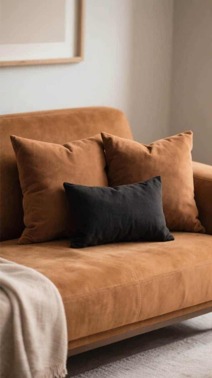
Think warm café vibes. Browns are back in a big way, and black is the eyeliner that makes the whole look pop.
What to Use
- Two 22” pillows in camel or toffee
- Two 20” pillows in deeper cocoa or espresso
- One black or charcoal lumbar in linen or leather
Why it works: Tonal browns feel grounded; a single black accent sharpens the silhouette and modernizes the palette.
- Choose warm inserts for a plush, sink-in effect.
- Balance with light throws if your sofa is dark to avoid a cave vibe.
8. Soft Glam: Blush, Ivory, and Metallic Hints
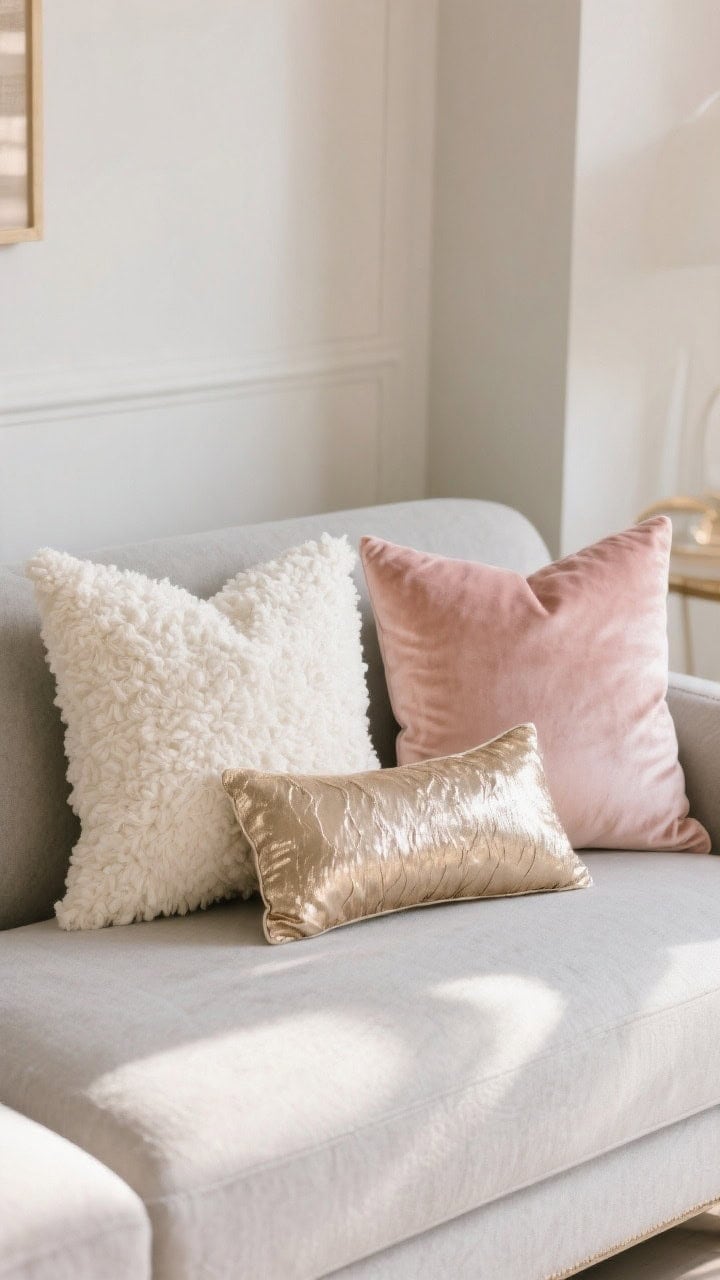
If your space wants a little glow-up (without full sparkle), do blushy tones with luxe textures and a wink of metallic. Subtle glam = daytime appropriate.
What to Use
- Two 22” ivory bouclé or sherpa pillows
- Two 20” blush or dusty rose velvet
- One metallic-thread lumbar (champagne, not mirrorball)
Bonus: Metallic thread or piping adds sheen without feeling gaudy. Aim for warm metals that flatter blush tones.
- Keep patterns minimal—let texture and sheen do the talking.
- Great on cream or light gray sofas and upholstered headboards.
9. Global Eclectic: Collected, Not Cluttered

Channel “I travel and have taste” even if your passport’s dusty. Mix artisan prints with tactile solids and one vintage-feel piece.
What to Use
- One block print or hand-printed 22” pillow
- One kilim or woven 20” pillow (earth tones or indigo)
- One solid heavy woven or mudcloth-inspired 20”
- One elongated lumbar (14×36) in a complementary stripe
Why it works: Varied origins and textures read curated. Keep the palette to two neutrals + one accent for harmony.
- Look for handfeel—slub, weave, stitched details.
- Mix old and new: a vintage textile with a crisp new solid = balanced.
10. Seasonal Switch: Light to Cozy in Two Steps

Don’t buy 47 pillows. Build a base set and swap a couple each season. Your storage closet will send a thank-you note.
What to Use
- Base year-round: Two 22” linen or cotton solids + one neutral lumbar
- Spring/Summer add-ons: airy stripe, botanical, or seersucker in 20”
- Fall/Winter add-ons: velvet, wool, or faux fur in 20” + a rich-toned lumbar
IMO: Inserts matter more than covers. Invest in good down or down-alternative and just rotate covers for a fresh look.
- Store off-season covers in zip bags with dryer sheets or cedar.
- Keep a cohesive base palette so seasonal swaps always align.
How to Arrange Like a Stylist (Quick Guide)
- Beds (Queen/King): 2–3 euros at the back, 2 squares in front, 1 long lumbar.
- Standard Sofa: 5 pillows: 2 large at the ends, 2 mediums in front, 1 lumbar off-center.
- Sectional: Anchor the corner with the largest pillow, then taper sizes outward.
- Rule of odds: 3 or 5 reads relaxed; 4 or 6 feels formal and balanced.
Fabric and Care Tips (Because Life Happens)
- Linen/cotton: Breathable, casual, gets softer with time. Spot clean; steam to de-wrinkle.
- Velvet: Luxe, color-saturated. Use a fabric brush; avoid heavy water spots.
- Bouclé/sherpa: Cozy texture, vacuum with upholstery attachment.
- Performance fabrics: Great for pets/kids. Look for removable, washable covers.
- Inserts: Size up by 1–2 inches for squares; same size for lumbars.
Color Pairings That Rarely Miss
- Olive + Rust + Sand for earthy warmth
- Navy + Camel + Ivory for tailored calm
- Blush + Charcoal + Champagne for soft glam
- Sage + Oat + Black for modern organic
Last thing: play. Try a combo, take a photo, tweak one piece, and compare. Your eye learns fast—and your sofa or bed will look like it hired a stylist. Now go fluff with confidence.