

10 Journal Cover Ideas That Make You Want to Write Every Day (no Excuses)
Your journal deserves to look as good as your thoughts feel. The right cover can literally pull you in, like “hey, let’s spill some secrets.” Whether you’re into minimal magic or maximalist drama, these ideas will turn your notebook into the kind of object you can’t not open. Pens up, friend.
This post includes affiliate links. If you make a purchase through them, I may earn a small commission at no extra cost to you. More details here.
1. Color-Blocked Linen With Bold Bands
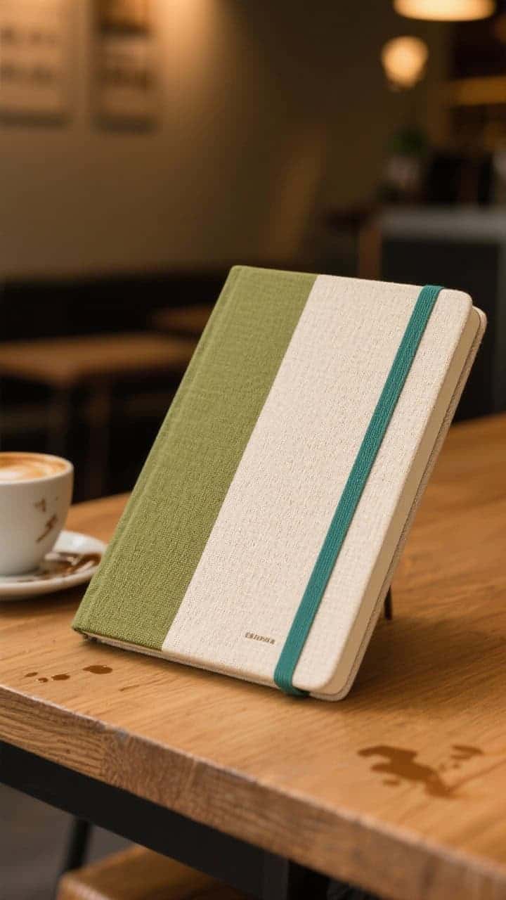
Clean lines, happy colors, and texture you can actually feel—what’s not to love? A color-blocked linen cover looks modern but still cozy, like your favorite café with the mismatched chairs and perfect lighting.
Why It Works
- Linen texture adds warmth and grip so it doesn’t slide around your desk.
- High-contrast bands make it pop on a shelf or tote bag.
- It feels intentional—like your thoughts have a dress code.
Try This
- Pick two complementary hues (sage + cream, navy + rust) and wrap adhesive linen fabric.
- Add a spine label in a third accent color for chic library vibes.
- Finish with a matte sealant so coffee splashes don’t become permanent art… unless you want that.
2. Vintage Book Jacket Remix
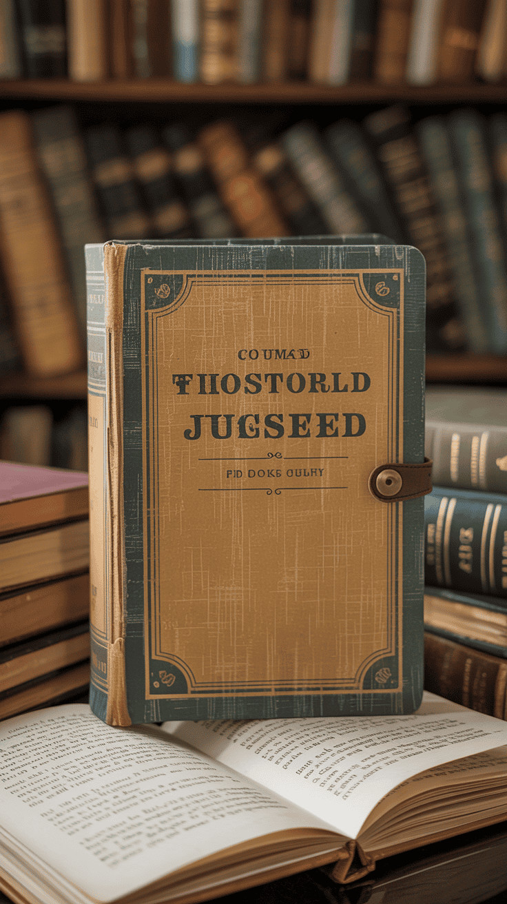
Old books have that quiet swagger. Borrow it. A vintage-inspired dust jacket turns your journal into a literary heirloom—instant gravitas, zero gatekeeping.
Why It Works
- Nostalgic palettes (mustard, forest, oxblood) whisper “write slow.”
- Classic typography makes your journal look like it belongs in a cool bookstore.
- It sets a mood: reflective, cozy, smart—great for long-form thinking.
Try This
- Design a faux publisher’s mark and “edition number.” Yes, that’s you, the author.
- Use textured paper (vellum or craft paper) and a simple title band on the spine.
- Wrap it like a real jacket—flaps and all—for tucked-in notes and receipts.
3. Pressed Botanicals Under Clear Acrylic
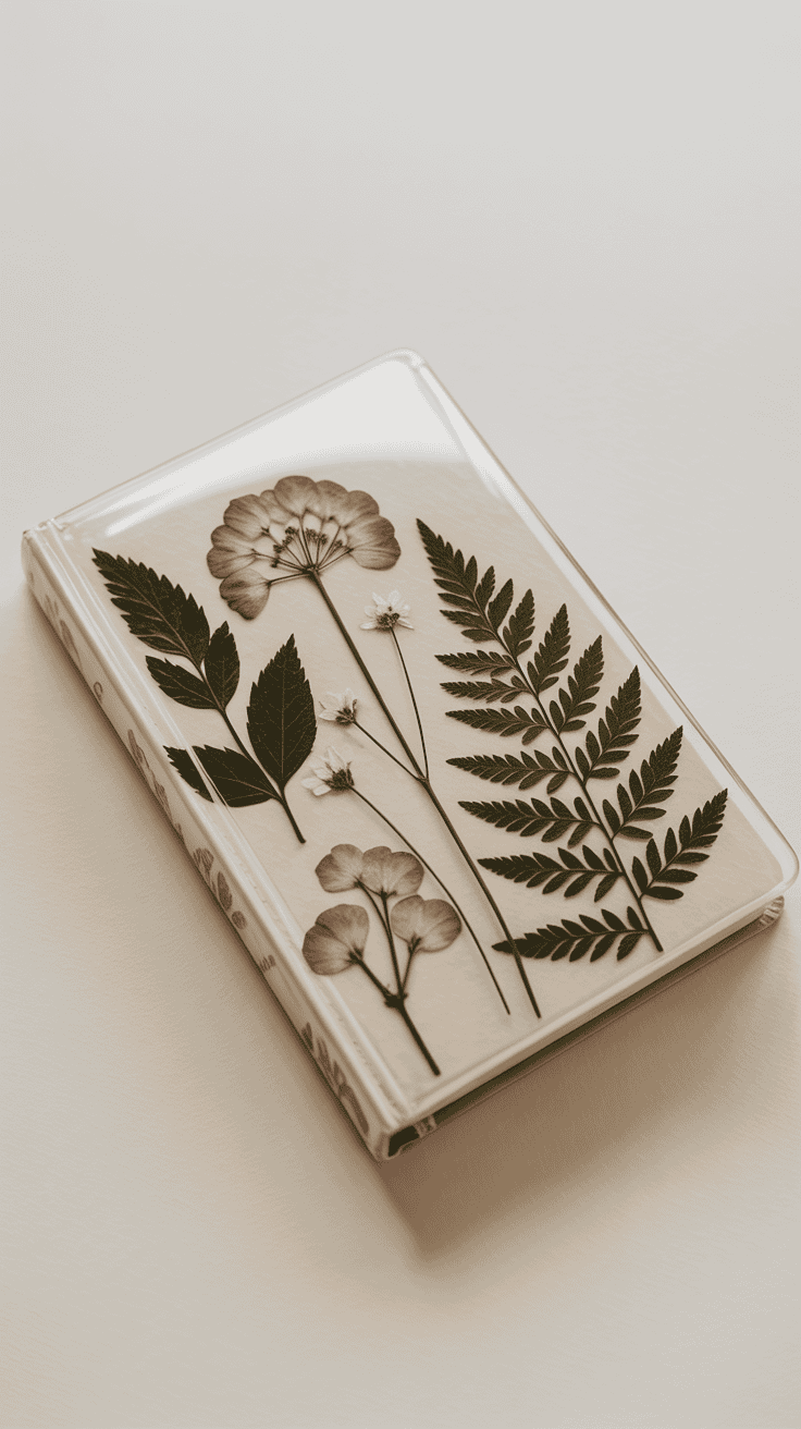
Nature always wins. A pressed flower or fern cover under a clear acrylic or vinyl layer feels like a tiny garden you can carry around—zero watering schedule required.
Why It Works
- Organic shapes are calming and irregular—perfect for creative flow.
- Translucency creates depth and dimension without heavy patterns.
- It ages beautifully, like a keepsake you’ll want to show off.
Try This
- Layer two or three botanicals with different sizes for a balanced composition.
- Seal with a clear laminating sheet or a custom acrylic cover screwed at the corners.
- Use a muted backdrop (cream or pale gray) so the greens and petals pop.
4. Minimal Monogram, Max Impact

There’s power in simplicity. A crisp monogram stamped or printed on a clean cover turns your journal into an everyday luxury—effortless and elevated.
Why It Works
- Personalization makes your journal feel like a daily ritual object.
- Negative space keeps it calm—great for focus and quick entries.
- Pairs with any decor or bag without screaming for attention.
Try This
- Choose a foil stamp in gold, copper, or matte white on leatherette or heavy card.
- Keep fonts clean—think Garamond, Didot, or a modern sans like Futura.
- Add a tiny date range beneath the monogram so it feels archival.
5. Collage Chaos (But Make It Curated)
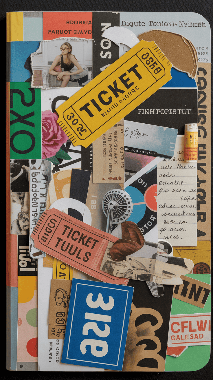
For the maximalists: turn the cover into a mini vision board. Think paper scraps, ticket stubs, magazine cutouts, maybe a tiny doodle or two. It’s messy in the best way.
Why It Works
- Storytelling before you even open the book—your tastes on full display.
- Texture and layers invite touch (and writing) daily.
- It evolves—add pieces as your life shifts. IMO, that’s the magic.
Try This
- Stick to a tight palette (three main colors) so it doesn’t become visual soup.
- Anchor with one larger image, then layer tiny elements around it.
- Seal with matte Mod Podge so it’s durable without a plasticky glare.
Related Reading
6. Soft-Touch Neutrals With Embossed Icons
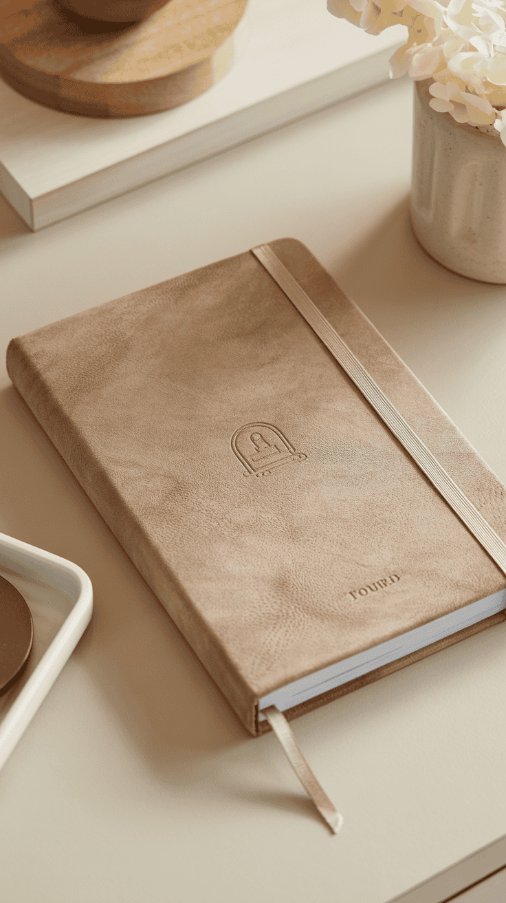
Think calm luxury. A soft-touch (suede-like) cover in warm neutrals with a tiny embossed icon—a star, wave, or coffee cup—feels like a spa day for your brain.
Why It Works
- Tactile comfort makes reaching for it irresistible.
- Micro-detail keeps interest without shouting.
- Neutral tones play nice with any desk setup or bag color story.
Try This
- Choose tonal embossing (camel on camel) for a quietly rich look.
- Add a ribbon marker and elastic band in a contrasting hue (moss or charcoal).
- If DIY, use a heat embossing kit with a small metal stamp—slow and steady.
7. Grid Meets Graffiti: Structured Play
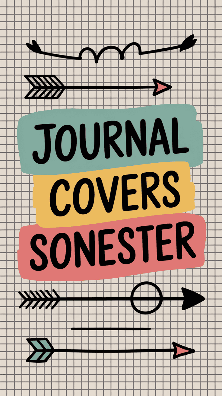
Can’t decide between tidy and wild? Do both. Start with a graph paper or dot grid base and layer hand-drawn marks—arrows, numbers, tiny quotes—in one or two ink colors.
Why It Works
- Structure calms the chaos; the doodles bring energy.
- Repeat motifs make it cohesive—even if your lines are wobbly (cute).
- It doubles as a warm-up: one quick doodle leads right into writing.
Try This
- Pick a theme (travel arrows, plant icons, cosmic dots) and repeat it.
- Limit ink to black + one accent (electric blue or rust) for editorial vibes.
- Finish with a satin spray to protect lines without smearing.
8. Leather (Or Vegan Leather) With Utility Stitching
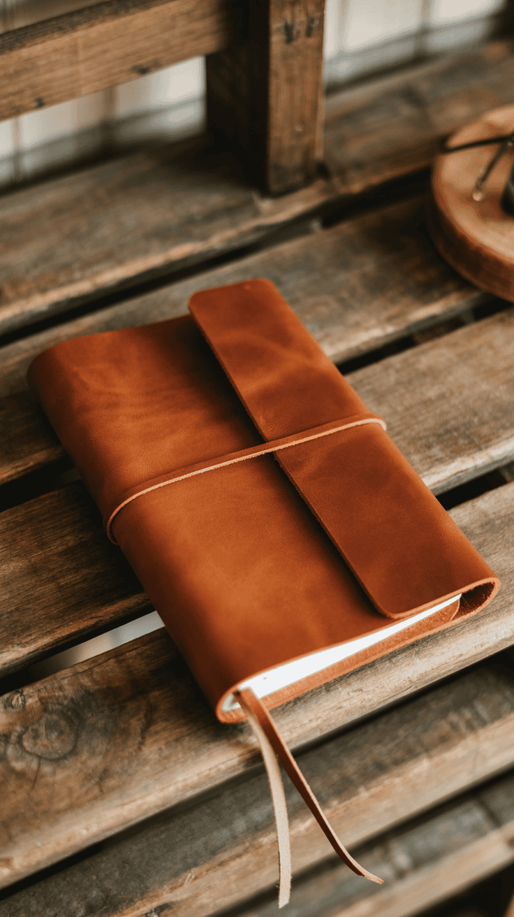
Nothing beats the confidence of a leather wrap cover with visible saddle stitching. It’s durable, classic, and a little rugged—like a field journal upgraded for city life.
Why It Works
- Patina gets better with time; your journal tells its own story.
- Stitching detail adds craft and makes it feel hand-made.
- It holds up to bags, travel, and your “I swear I’m gentle” lifestyle.
Try This
- Choose cognac, charcoal, or olive and stitch with contrasting wax thread.
- Add a pen loop and a minimalist wrap tie or snap closure.
- Monogram the lower corner for a bespoke finish—FYI, blind deboss looks chef’s kiss.
9. Painted Ombre With Hand-Lettered Title

Bring the drama with a gradient wash—sunset pink to coral, midnight to dusk, seafoam to jade—and a hand-lettered title to top it off. Instant mood board energy.
Why It Works
- Color psychology sets the tone—calm blues, energizing corals, grounding greens.
- Soft transitions are soothing and feel fresh every time you pick it up.
- It’s highly personal: your handwriting = your vibe.
Try This
- Use acrylic gouache for rich color that won’t crack; blend with a damp sponge.
- Letter with a paint pen in white or metallic; keep it short: “Notes,” “Dreams,” “Daily.”
- Edge-paint the pages for a subtle wow when it’s closed.
10. Minimal Map Cover With Your “Why”
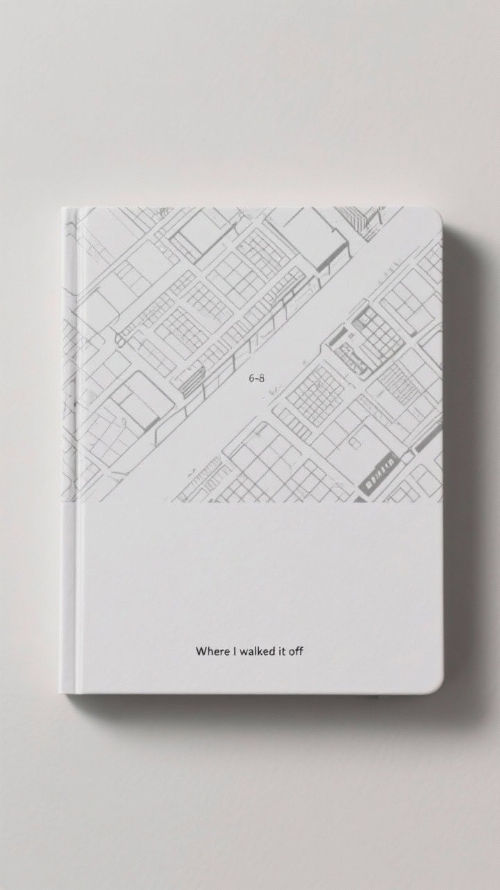
Travel nerds, this one’s for you. Print a simplified map—your city, a favorite hike, a coastline—in monotone lines, then add a tiny caption that says why it matters.
Why It Works
- Place-based meaning makes the journal feel like a companion, not a chore.
- Monochrome lines are clean and architectural—great for daily notes.
- The small caption keeps it intimate without oversharing.
Try This
- Generate a contour or street map in black or charcoal; print on heavyweight matte paper.
- Add a 6–8 word micro dedication in tiny type: “Where I walked it off.”
- Finish with a clear laminate or book film so the lines stay crisp.
Quick Extras That Elevate Any Cover
- Hardware: Corner protectors, Chicago screws, or a slim bookmark charm.
- Labels: Spine date labels or tiny category tags (“Ideas,” “Gratitude”).
- Texture play: Mix matte with a small glossy element for contrast.
- Edges: Painted or gilded page edges = instant boutique feel, FYI.
Choosing Your Daily-Use MVP
- Are you messy or meticulous? Choose sealed covers if you’re spill-prone.
- Bag life? Go durable: leatherette, laminated paper, or acrylic overlays.
- Mood goals: Calm colors for focus, saturated tones for energy.
- Time factor: Need it now? Monograms and stickers. Weekend project? Collage or stitching.
Bottom line: your cover should invite you in, not lecture you from the shelf. Pick the idea that feels like a wink from future-you—the one who actually finished the page. Then make it real and start writing. You’ve got this.
As an Amazon Associate, MiaFolio may earn from qualifying purchases.