Farmhouse Bedroom Color Palettes to Consider: Top Choices
Did you know 68% of interior designers recommend neutral tones as the foundation for creating calming spaces? This approach lies at the heart of modern farmhouse design, where simplicity meets character. Your sanctuary deserves a palette that balances warmth and refinement—let’s explore how to achieve it.
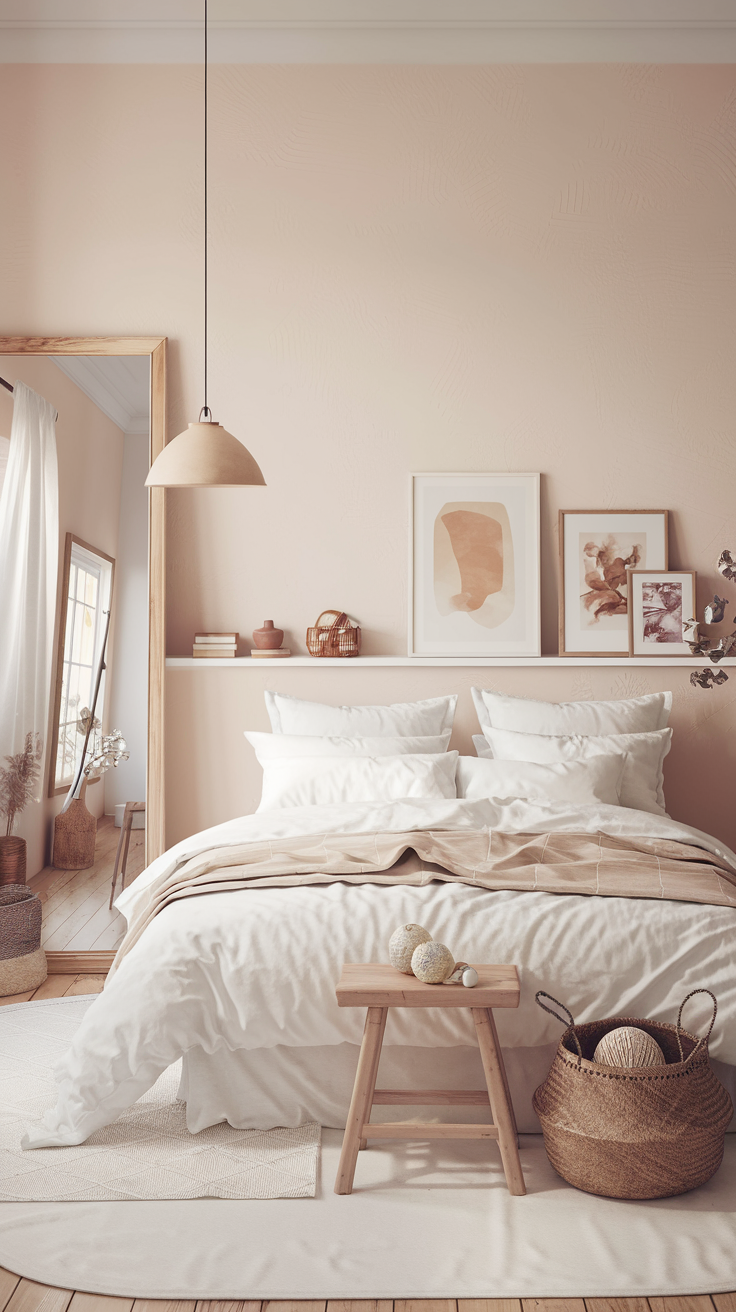
The modern farmhouse aesthetic blends weathered textures with clean lines. Think soft whites paired with earthy undertones or muted grays warmed by natural wood accents. Brands like Benjamin Moore’s White Dove and Sherwin Williams’ Alabaster have become staples for their versatility in different lighting conditions.
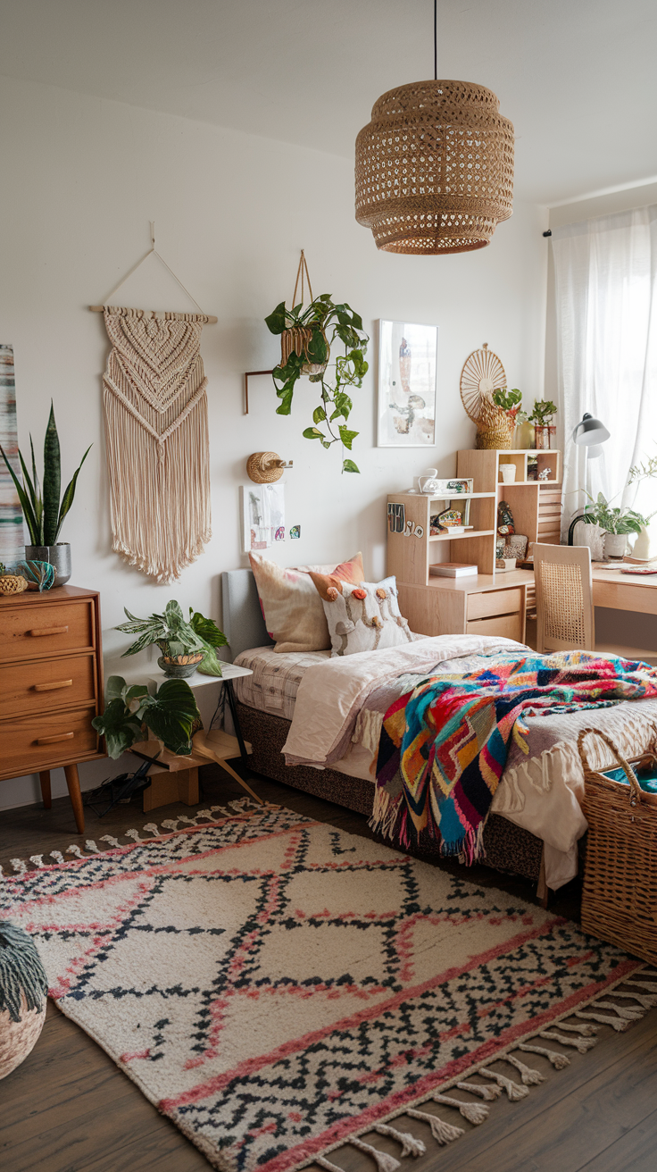
This guide walks you through creating harmony between rustic charm and contemporary flair. You’ll discover how layering materials like linen and reclaimed wood adds depth. We’ll also discuss strategic pops of color—think sage green throw pillows or terracotta pottery—to personalize your retreat without overwhelming the senses.
Key Takeaways
- Neutral bases like warm whites create adaptable backdrops for texture and accent colors
- Combining matte finishes with natural materials enhances rustic-modern balance
- Lighting dramatically affects how paint colors appear throughout the day
- Timeless options like Alabaster work across furniture and wall applications
- Strategic accent placement maintains visual calm while adding personality
Introduction to Farmhouse Bedroom Color Palettes
Neutral tones aren’t just safe choices—they’re the backbone of a design that feels timeless yet fresh. Modern farmhouse palettes blend earthy hues like warm taupes and weathered grays, creating rooms that breathe calm. These shades work like a canvas, letting textures and materials shine without competing for attention.
At its core, this style balances rustic character with clean simplicity. Think linen bedding against reclaimed wood headboards or stone accent walls softened by ivory paint. Natural elements ground the design, while muted colors maintain visual peace. You’ll notice how matte finishes on walls let raw wood beams take center stage—a harmony of old and new.
Color plays a pivotal role in shaping your room’s energy. Soft greige tones promote relaxation, while deeper clay accents add subtle warmth. For those exploring combinations, curated options simplify finding cohesive schemes. Later sections will detail how lighting and materials elevate these palettes from basic to breathtaking.
Understanding the Modern Farmhouse Aesthetic
At its core, the modern farmhouse look celebrates contrasts: rough textures against smooth surfaces, vintage finds beside minimalist elements. This style thrives on pairing timeworn materials like hand-hewn beams with crisp, uncluttered lines. It’s about creating spaces that feel lived-in yet intentional—where every choice tells a story.
Rustic Charm Meets Contemporary Elegance
Imagine a reclaimed barn door sliding across a wall painted in Sherwin Williams’ Agreeable Gray. Or industrial sconces illuminating a live-edge wooden nightstand. These combinations highlight the aesthetic’s magic—honoring heritage while embracing today’s clean-lined preferences. The key lies in balance: one weathered element for every polished finish.

The Role of Neutral and Earthy Tones
Soft whites and muted greens act as peacekeepers in this design dialogue. They let raw materials shine without visual competition. Consider Benjamin Moore’s Simply White on walls, allowing oak floor grains to become the star. Earthy tones like clay or slate add warmth, grounding the color palette in nature’s rhythm.
Light plays tricks here. Morning sun might reveal hidden undertones in your beige rug, while evening lamps cast amber glows on stone accents. This dynamic quality keeps rooms feeling alive yet anchored—a hallmark of thoughtful farmhouse design.
Key Elements in Creating a Farmhouse Bedroom
True character in design emerges when materials tell stories. Your space becomes more than a room—it transforms into a tactile narrative of craftsmanship and history. Let’s explore how to layer these elements without creating visual noise.

Incorporating Vintage & Natural Materials
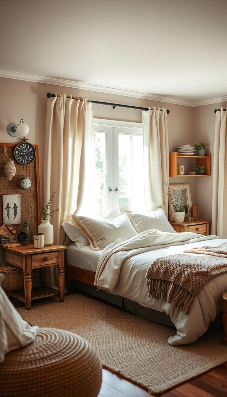
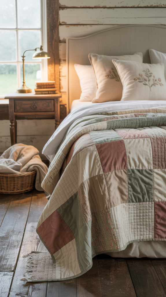
Reclaimed barn wood headboards or stone accent walls anchor the design in authenticity. These pieces bring weathered charm that new furniture can’t replicate. Metal bed frames with patina work beautifully against crisp linen bedding—proof that contrasts create depth.
Consider salvaged door turned into a mirror frame or antique milk paint on a dresser. These touches add soul without overwhelming. For inspiration, explore curated vintage finds that balance function and nostalgia.
Mixing Wood, Textures, and Patterns
Layer a chunky knit throw over smooth cotton sheets. Pair rough-hewn nightstands with sleek ceramic lamps. This interplay keeps eyes moving while maintaining harmony. Distressed finishes on wood beams gain warmth when flanked by matte wall paint colors like Farrow & Ball’s Pointing.
Classic gingham curtains or plaid wool throws introduce rhythm. Keep patterns small-scale—think subtle stripes on pillowcases rather than bold wallpapers. The goal? A palette that feels collected over time, not meticulously matched.
Your final layer comes through lighting: wrought iron sconces casting soft shadows across varied textures. This approach turns ordinary materials into extraordinary moments.
Neutral Base Colors: The Foundation for Serenity
In the quiet embrace of a well-designed space, neutral hues work their subtle magic. These tones act as visual anchors, grounding your room while letting personality emerge through textures and accents. Their strength lies in adaptability—shifting with light and seasons without losing their calming essence.
Benefits of Whites, Beiges, and Grays
Soft whites like Benjamin Moore’s White Dove create airy backdrops that magnify natural light. Warm beiges add depth without heaviness, perfect for balancing rustic wood furniture. Cool grays, such as Sherwin Williams’ Alabaster, introduce sophistication while maintaining coziness.
These shades excel at visual harmony. A linen headboard stands out against a creamy wall, while woven baskets gain prominence on gray flooring. Unlike bold colors, neutrals won’t compete with your favorite quilt or heirloom dresser.
Consider how morning sun transforms a pale wall from soft pearl to golden warmth. Evening lamplight turns beige tones into honeyed glows. This dynamic quality keeps rooms feeling fresh yet familiar—a hallmark of thoughtful design.
Bold Accent Options for Farmhouse Charm
Strategic color choices can elevate a space without overwhelming it. Thoughtful accents act as punctuation marks in your design story—adding rhythm and focus to neutral foundations. The key lies in selecting hues that complement rather than compete, creating moments of delight.

Navy Blue, Sage Green, and Barn Red Accents
Deep navy throw pillows anchor a cream-colored sofa, while sage green curtains frame sunlit windows. These tones bring nature’s depth indoors, reinforcing connection to the outdoors. Barn red pottery on floating shelves offers warmth against white walls—proof that boldness thrives in moderation.
Place accents where eyes naturally rest: a single painted dresser drawer or patterned rug beneath the bed. Matte black lamp bases paired with ceramic blue vases create contrast without chaos. Remember—these pops of color work best when repeated subtly elsewhere, like matching book spines or framed art.
Lighting magnifies their impact. Morning sun intensifies sage’s earthy vibrancy, while evening lamps cast dramatic shadows behind navy headboards. Natural wood frames or jute rugs keep these accents grounded, ensuring your space feels curated rather than cluttered.
Expert Tips for Choosing Your Farmhouse Palette
Testing paint in your actual space reveals truths no catalog can show. Natural light shifts throughout the day, altering how colors interact with your room’s unique features. Professional designers recommend painting 2’x2’ samples on multiple walls, observing them at dawn, noon, and under evening lamps.

Compare finishes side-by-side: matte hides imperfections but stains easily, while satin offers wipeable practicality. A modern farmhouse color guide suggests pairing eggshell walls with semi-gloss trim for subtle contrast. Always test near existing furniture—that oak dresser might pull warm undertones from your gray paint.
- Observe samples for 72 hours across weather conditions
- Use foam boards to move color swatches around the space
- Note how artificial bulbs (warm vs cool) change hues
Balance style with function: Will that chalky white show fingerprints? Can your accent wall coordinate with bedding patterns? Create a design board with fabric scraps and wood stains to visualize cohesion. This method prevents costly repaints and ensures your palette feels intentional, not accidental.
Trust your instincts—if a shade feels “off” at noon but sings at candlelight, adjust your lighting plan rather than abandoning the color. Great design solves puzzles through layered solutions.
Integrating Natural Materials and Texture
Your fingertips tell stories before your eyes do. Natural elements create spaces that feel authentically grounded, inviting touch as much as sight. This approach transforms rooms into sensory experiences where every surface whispers of earth and craft.

Start with foundational choices: reclaimed oak flooring underfoot or a slate feature wall anchoring the space. These materials carry history in their grains and fissures, offering visual weight that synthetic alternatives can’t replicate. Pair them with airy linen bedding to prevent heaviness—the contrast between rugged and refined defines modern rustic charm.
Utilizing Wood, Stone, and Linen
Imagine rough-hewn cedar beams framing windows dressed in flax-colored drapes. The wood’s warmth plays against linen’s casual elegance, creating balance. Stone accent walls work similarly, their cool textures offset by woven jute rugs. These combinations prove that materials speak louder than colors alone.
Consider these pairings:
- Barn door headboards with crisp cotton duvets
- River rock side tables beside wool throw blankets
- Ceramic lamps atop distressed pine nightstands
Matte finishes on walls let stone or wood features shine without glare. Keep your base palette neutral—soft whites or warm greys—to let textures take center stage. A single stone wall behind the bed becomes a focal point, while linen curtains diffuse light into gentle glows.
Layering is key. Add a chunky knit throw over smooth leather chairs, or place polished agate bookends beside raw-edge shelves. This interplay between coarse and refined elements adds depth that flat decor can’t achieve. Your space becomes a tapestry of touchable moments, each layer inviting closer inspection.
Trending Paint Finishes and Techniques
The right paint finish acts like a quiet conductor—it directs light, influences texture, and shapes your room’s atmosphere. While shades grab attention, finishes determine how colors interact with surfaces and lighting. Your choice here impacts both visual harmony and daily practicality.
Satin, Matte, Eggshell, and Gloss Comparisons
Satin finishes whisper sophistication with their soft pearl-like glow. They’re ideal for walls needing gentle wipeability—think spaces where morning light dances across surfaces. Matte options absorb light, hiding wall imperfections while creating velvety depth perfect for accent features.
Eggshell strikes a middle ground. Its low-luster finish works well in bedrooms, resisting fingerprints better than flat paints. Gloss? Reserve it for trim or doors—its mirror-like sheen highlights architectural details but amplifies every flaw.
- Satin: 35-50% sheen | Easy cleaning | Shows brush strokes
- Matte: <10% sheen | Hides flaws | Stains easily
- Eggshell: 10-25% sheen | Balanced durability | Limited scrubbing
- Gloss: 70-85% sheen | High traffic areas | Requires smooth surfaces
Lighting transforms these finishes. North-facing rooms benefit from satin’s reflective quality, while matte tones soften harsh southern sun. Test samples on foam boards—move them around your space at different hours. Notice how dawn’s blue light cools warm beiges, or evening lamps turn eggshell walls golden.
For touch-friendly surfaces like headboards, consider matte’s velvety appeal. High-traffic zones demand satin’s resilience. Pair Benjamin Moore’s Regal Select Matte with semi-gloss trim for contrast that feels intentional, not jarring.
Still uncertain? Paint a closet interior first. Live with it for three days—how does artificial lighting affect the mood? This hands-on approach ensures your final choice balances beauty with real-world living.
Layering Textures and Patterns for Depth
Design becomes memorable when layers converse rather than compete. Imagine your space as a visual symphony—each texture and pattern contributes distinct notes that harmonize into a cohesive whole. This approach transforms flat surfaces into dynamic landscapes that invite exploration.
Mixing Plaid, Gingham, and Florals
Start with foundational pieces in neutral hues—a linen duvet or wool throw. Layer plaid pillows against gingham curtains, letting their scales differ to avoid visual clash. A floral throw draped over a chair introduces organic shapes, softened by shared earth-toned palettes.
Amplify connections through color repetition. Sage in plaid pillowcases might echo faded green stems in floral art. This creates rhythm without monotony. For balance, limit bold patterns to 30% of your space—let quieter textures like nubby rugs or smooth ceramics anchor the look.
- Use similar saturation levels across patterns
- Vary scale: large florals with small-checked gingham
- Anchor with solid-colored bedding or drapes
A subtle accent wall with vertical shiplap or grasscloth wallpaper unifies diverse elements. Its linear pattern grounds busier textiles while adding tactile interest. Pair with matte black hardware to maintain modern rustic balance.
Remember: contrast creates depth. Rough burlap lampshades gain sophistication beside polished marble nightstands. A chunky knit blanket softens crisp cotton sheets—proof that opposing textures elevate comfort and style.
Optimizing Natural and Artificial Lighting Effects
Light shapes more than visibility—it defines how your space breathes and evolves through the day. The interplay between sunshine and bulbs transforms neutral walls into dynamic canvases, revealing hidden warmth in beige tones or crispness in soft grays. Proper lighting doesn’t just highlight your design—it becomes part of the story.
Maximizing Natural Light
Sheer linen curtains soften harsh sunlight while preserving brightness. Position mirrors opposite windows to bounce rays deeper into the room—a vintage-framed glass above a dresser works wonders. Keep furniture low near windows; a streamlined bench under the sill won’t block incoming glow.
Morning light intensifies earthy color undertones, while afternoon rays mute bold accents. Test paint samples at different hours to see how your sage green headboard shifts from vibrant to subdued. North-facing rooms benefit from warm whites, balancing the cool natural light.
Choosing Complementary Artificial Fixtures
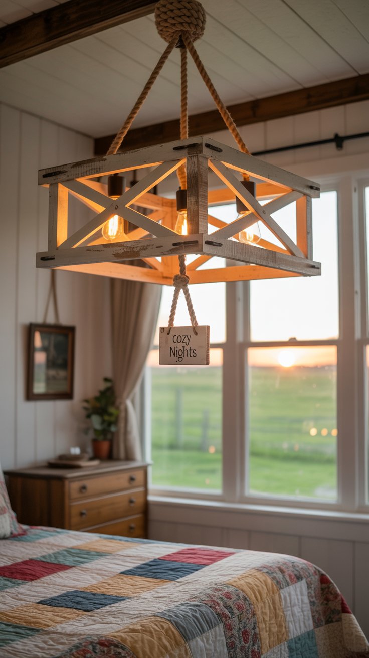
Layer lighting like you layer textures: recessed ceiling lights for ambient warmth, swing-arm sconces for reading nooks. Opt for bulbs between 2700-3000 Kelvin—they mimic sunset’s golden hue without yellowing walls. A black iron chandelier with Edison bulbs adds rustic charm while casting intricate shadows on shiplap.
- Use dimmers to adjust mood from energizing mornings to cozy evenings
- Place table lamps at varying heights to create depth
- Match metal finishes to hardware (oil-rubbed bronze with iron bed frames)
Directional spotlights can emphasize a stone accent wall, making each groove feel tactile. For subtle drama, install LED strip lighting under floating shelves—it washes the wall below in a gentle blue-tinged glow during night hours.
Farmhouse Bedroom Color Palettes to Consider
The secret to timeless design lies in knowing which combinations endure beyond trends. Leading brands now offer carefully crafted schemes that blend heritage charm with contemporary practicality. These palettes act as flexible frameworks, allowing personal expression while maintaining cohesive appeal.
Curated Palettes from Leading Brands
Benjamin Moore’s Wind’s Breath pairs beautifully with weathered oak furniture, creating airy sophistication. Sherwin Williams’ Origami White serves as a versatile base for slate blue accents in coastal-inspired rooms. For deeper warmth, consider Farrow & Ball’s Mouse’s Back on accent walls—its gray-brown undertones complement both modern and vintage elements.
These selections share common traits: subtle complexity and adaptability. A single gallon can transform furniture pieces or architectural details. Pro tip: Use sample pots to test how colors interact with your room’s specific lighting and textures before committing.
Seasonal Adaptations for Modern US Homes
Lighter palettes shine in sun-drenched summer spaces—try layering crisp whites with muted sage accents. As autumn arrives, introduce spiced ochre throws or terracotta pottery against neutral backdrops. Northern climates benefit from warm greige walls that counteract gray skies, while southern homes might opt for cooler taupes to balance intense sunlight.
Seasonal shifts don’t require full redecorating. Swap out pillow covers or rotate artwork featuring seasonal hues. A spring refresh could mean adding fern-green linen curtains to an existing ivory-and-wood scheme. These thoughtful tweaks keep your space feeling current without disrupting its foundational harmony.
Seasonal and Ambient Considerations in Home Decor
Seasons whisper their influence through your windows, subtly shifting how colors feel in your sanctuary. Summer sunlight amplifies crisp whites into radiant backdrops, while winter’s softer glow deepens warm taupes into cozy cocoons. Your space evolves with these changes—smart decor adapts while keeping its core aesthetic intact.
Ambient factors play conductor to your palette’s mood. Cool north-facing rooms benefit from honey-toned linens that counteract gray light, while south-facing spaces might need sheer curtains to soften intense midday rays. Notice how evening lamps cast amber warmth onto neutral walls, transforming beige into caramel.
Swap lightweight linen pillowcases for textured wool throws as temperatures drop. Introduce sage-green accents in spring through botanical prints or clay planters. These micro-changes refresh your atmosphere without disrupting harmony. A cohesive base—like weathered wood furniture or ivory walls—anchors seasonal shifts.
Choose transitional hues that straddle seasons: muted olive greens work under summer sun and autumn clouds. Test paint samples under both natural and artificial light to ensure flexibility. Remember, your palette isn’t static—it’s a living response to the light, air, and energy flowing through your home.
Conclusion
True harmony in living spaces emerges when every design choice serves purpose and poetry. You’ve discovered how neutral foundations let textures sing, while strategic green accents or reclaimed wood furniture add soulful contrast. This balance transforms rooms into sanctuaries where lighting dances across matte walls and linen drapes sway with breezes.
Remember: elegance thrives in thoughtful details. A stone wall behind your bedframe, lamps casting amber glows on open shelving—these touches create rhythm. Your space becomes a testament to patience, where each layer builds toward calm sophistication.
Trust your instincts as you blend brands like Farrow & Ball’s earthy tones with vintage finds. Let our tips guide without dictating—your personal sense of comfort matters most. Whether refining a color scheme or testing paint finishes, approach decisions as curated experiments rather than rigid rules.
Layer textures mindfully, leave room for evolution, and watch how decor choices deepen your connection to home. After all, great design isn’t about perfection—it’s crafting spaces that whisper, “Welcome, stay awhile.”