
10 Unexpected Bathroom Color Schemes That Work (and Look Way More Expensive)
Let’s be real: most bathrooms are stuck in a white-and-gray rut. Safe? Yes. Memorable? Not so much. If you’re ready to give your bathroom a glow-up, these 10 unexpected color schemes prove you can be bold without scaring off your future self. Think rich hues, clever contrasts, and combos you didn’t know you needed.
This post includes affiliate links. If you make a purchase through them, I may earn a small commission at no extra cost to you. More details here.
1. Moody Teal + Burnished Brass
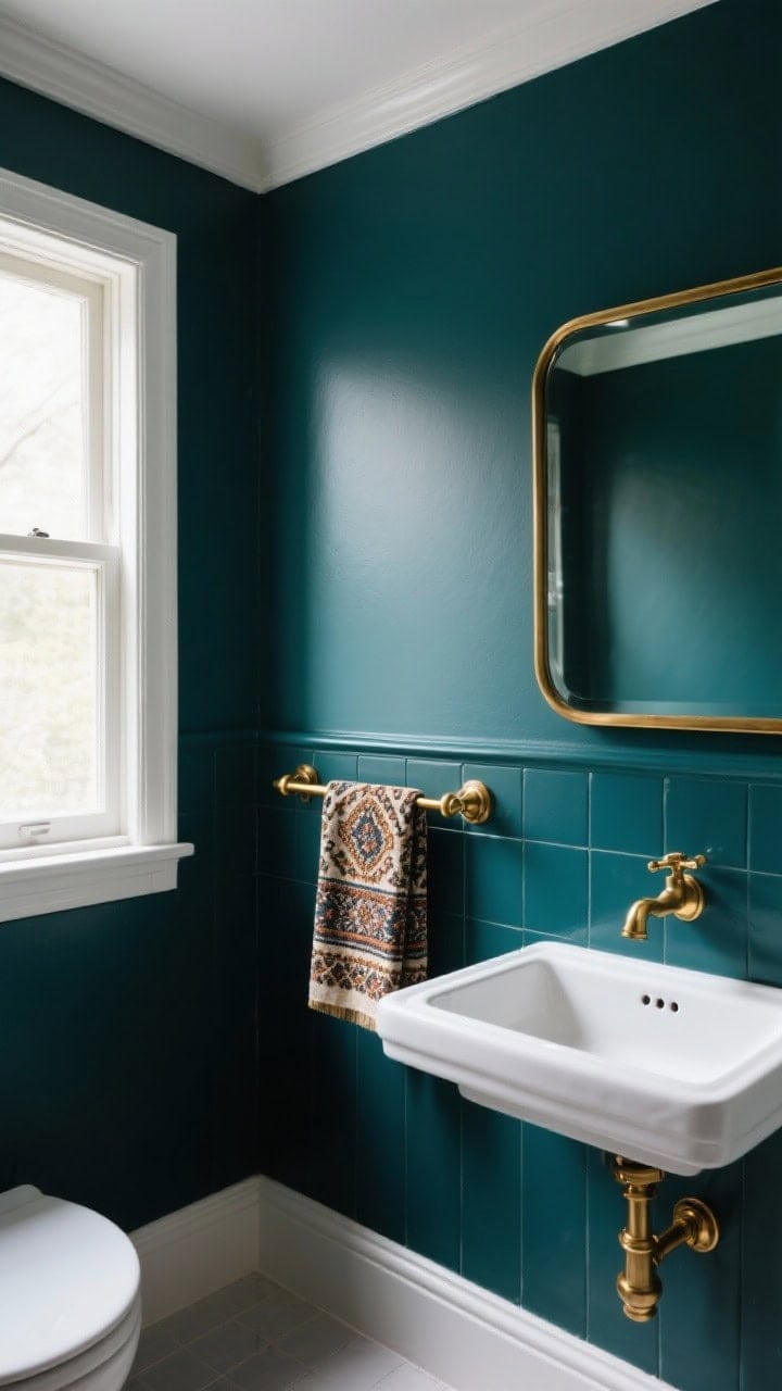
Teal is the moody cousin of navy—dramatic but not dark-and-gloomy. Paint the walls a deep teal and bring in burnished brass fixtures for warmth and glow. The combo feels luxe without requiring a marble budget.
Why It Works
- Teal adds depth and plays well with natural light.
- Brass warms up cool tones and reflects light beautifully.
Pro Tips
- Keep grout and trim crisp white to avoid a cave vibe.
- Go matte on the walls, satin or polished on the metal for contrast.
- Add a patterned Turkish towel for texture—and yes, it can hang there and look “casually perfect.”
2. Clay Terracotta + Powder Blue
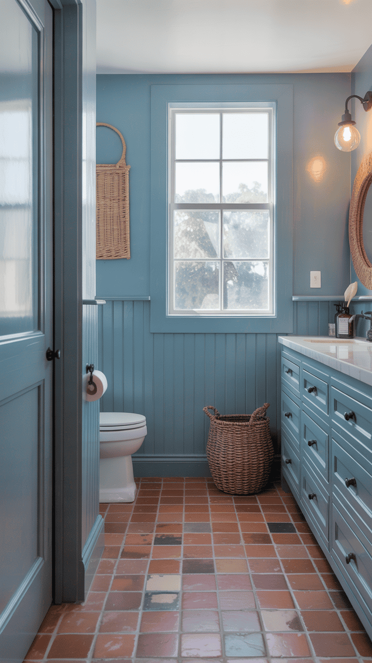
Think Mediterranean summer, but make it bathroom-friendly. The earthy warmth of terracotta with airy powder blue is unexpected in the best way—grounded and breezy at the same time.
Why It Works
- Warm terracotta anchors the space; powder blue keeps it light.
- The combo flatters skin tones (hello, mirror selfies).
Pro Tips
- Use terracotta on floors or vanity fronts; keep blue on walls or beadboard.
- Bring in matte black hardware to sharpen the palette.
- FYI: A woven blind or seagrass basket pulls it all together.
3. Eggplant Purple + Soft Blush
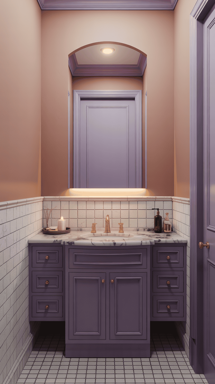
This is your quiet-luxury moment. Eggplant gives you richness and drama, while blush keeps it soft and romantic. It’s a grown-up palette that still feels playful.
Why It Works
- High contrast in saturation, not brightness—so it feels elevated, not loud.
- Blush acts like a warm neutral against deep purple.
Pro Tips
- Try eggplant on the vanity and blush above tile wainscoting.
- Choose antique gold or brushed nickel fixtures—chromes can feel too cold here.
- A marbled countertop with violet veining? Chef’s kiss.
4. Charcoal Gray + Citrus Chartreuse
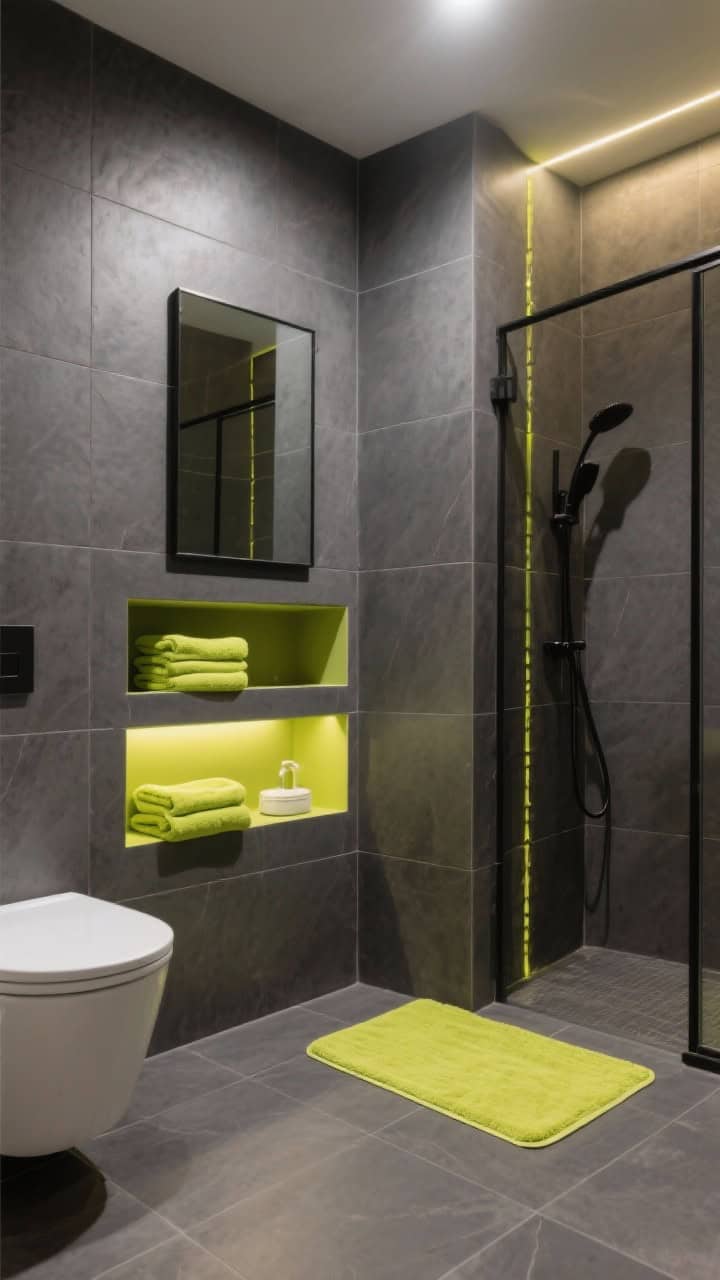
If your heart says modern but your brain says “let’s have fun,” this combo is your sweet spot. Charcoal gives structure and calm; chartreuse pops like a highlighter in all the right places.
Why It Works
- Dark neutral + electric accent = instant design credibility.
- Chartreuse reads chic when it’s used sparingly.
Pro Tips
- Keep chartreuse to towels, a bath mat, or a niche tile stripe.
- Opt for matte charcoal tiles for a soft, sophisticated finish.
- Use warm LED bulbs so the green doesn’t skew hospital-bright, IMO.
5. Forest Green + Cream + A Touch Of Black
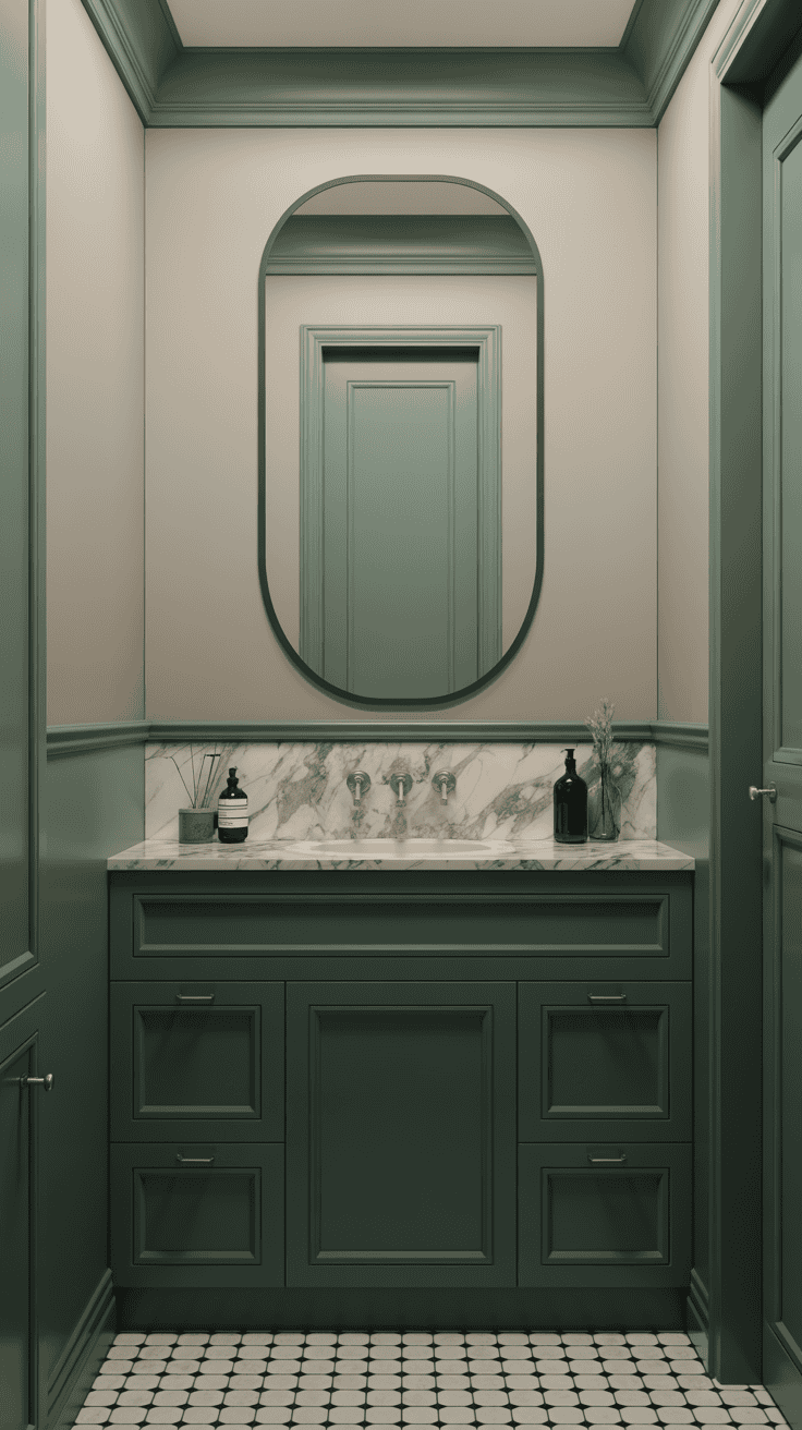
Nature’s neutrals for the win. Forest green is timeless, cream keeps it fresh, and a whisper of black adds polish. It’s classic without feeling tired.
Why It Works
- Green pairs with wood, stone, and metal without clashing.
- Black lines (think mirror frames) add just enough edge.
Pro Tips
- Go green on wall paneling or vanity, cream on upper walls.
- Choose unlacquered brass or black fixtures—both look great with green.
- Marble with gray veining keeps the palette calm and cohesive.
6. Dusty Lavender + Warm Walnut

Lavender isn’t just for nurseries. Pick a dusty, grayed-out lavender and pair it with warm walnut wood. The result? Calm, spa-like, and not even a little bit twee.
Why It Works
- Muted purple leans sophisticated, not sweet.
- Walnut’s honey undertones make lavender feel cozy.
Pro Tips
- Use lavender on walls; bring walnut in via vanity or shelving.
- Keep metals soft: brushed nickel or champagne bronze.
- Textured linen shower curtain = instant boutique-hotel vibes.
7. Ink Black + Soft Sage
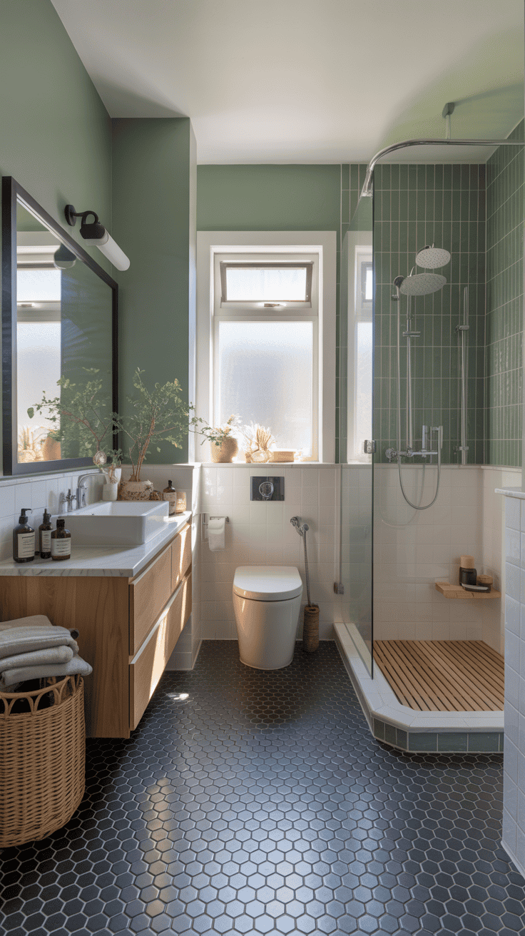
Yes, black in a bathroom. Done right, it looks seriously chic—not cave-like. Ink black paired with soft sage gives contrast with a calming, organic twist.
Why It Works
- Black adds architecture; sage keeps the mood serene.
- It’s dramatic but still soothing—perfect for small spaces.
Pro Tips
- Try black hex tiles on the floor; paint walls sage to lighten.
- Use light wood accents to prevent heaviness.
- Large mirror + clear glass shower = more light bounce.
8. Coral Pink + Ink Blue
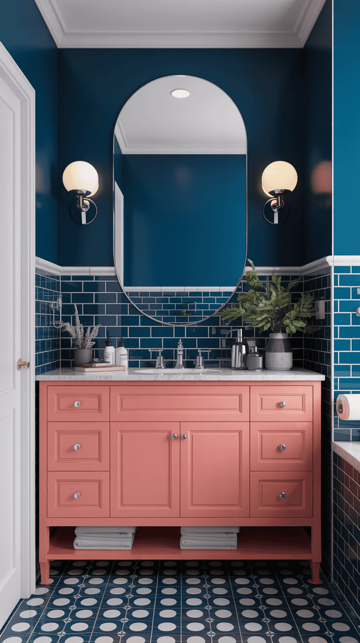
High-energy but surprisingly sophisticated. Coral brings the fun; inky blue adds depth and keeps the combo grounded. It’s like a sunset meeting the ocean—and your bathroom is the beach, obviously.
Why It Works
- Warm coral pops against cool blue without clashing.
- Dark blue helps coral read elegant, not neon.
Pro Tips
- Use coral on a vanity or ceiling; navy tile or paint for the walls.
- Polished nickel or chrome works best here—clean and crisp.
- Balance patterns: bold shower curtain, simple rug (or vice versa).
9. Mustard Yellow + Cement Gray
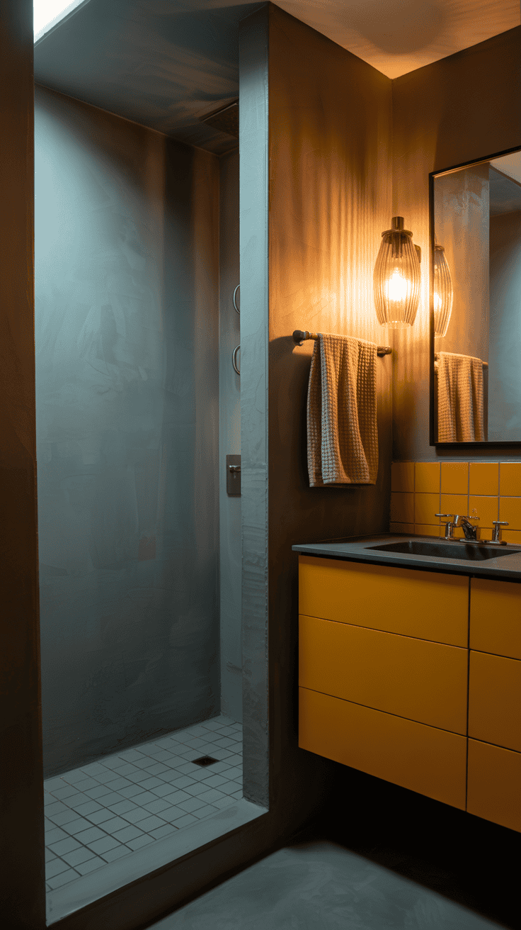
Industrial, but make it happy. Mustard warms up clean cement gray without tipping into “school bus” territory. It’s a confident choice that doesn’t scream for attention.
Why It Works
- Gray is the perfect neutral canvas for a saturated yellow.
- Mustard plays nicely with wood, brass, and black.
Pro Tips
- Keep mustard to one focal point: vanity, framed mirror, or tile stripe.
- Use light gray on walls and deeper gray on floors for depth.
- Textured towels and a ribbed glass sconce add tactile interest.
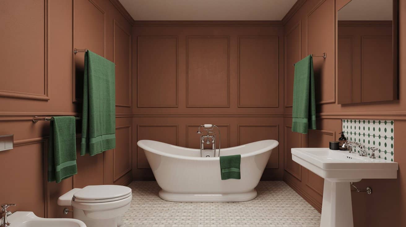
10. Cocoa Brown + Sky White + Emerald
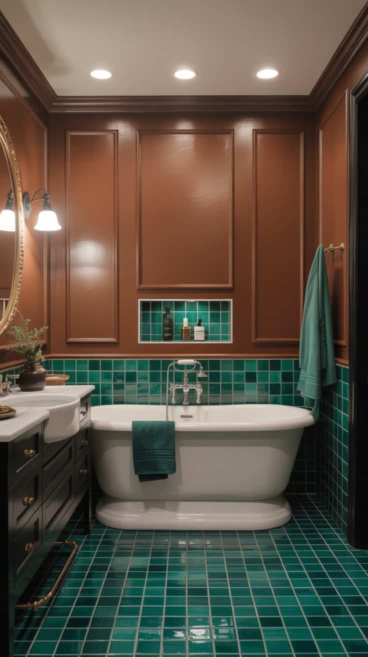
Brown is back, and it’s shockingly chic. Pair cocoa with crisp white and a dash of emerald for a rich, tailored look. It’s like a chocolate box with a velvet ribbon—delicious.
Why It Works
- Brown adds warmth; white keeps it fresh; emerald gives a jewel-toned pop.
- It’s cozy without feeling dark or dated.
Pro Tips
- Use cocoa on walls or floor tile; keep the tub and sink bright white.
- Bring in emerald through towels, art, or a small tile inset.
- Go for aged brass or blackened bronze fixtures for depth.
Lighting + Finish Cheatsheet
- Warm whites (2700–3000K) flatter skin and soften cool palettes.
- Matte paint hides imperfections; semi-gloss is more wipeable near splash zones.
- Mixing metals? Keep to two finishes max and repeat each at least twice.
Small Bathroom? Do This
- Run tile vertically to add height; keep grout close in tone for less visual clutter.
- Use one bold color and repeat it in 3 spots for cohesion (vanity, towels, art).
- Mirrors with thin frames make color the star without crowding the room.
Ready to break up with basic? Pick the palette that makes you smile and commit in at least two places—paint and textiles, tile and vanity, whatever feels doable. Bathrooms are small, so color goes a long way. Worst case, it’s paint. Best case, you create the bathroom everyone compliments unprompted (the dream, FYI).