Color Schemes That Make Small Apartments Look Spacious
What if the secret to transforming your cramped flat wasn’t about knocking down walls, but simply choosing the right paint? Designers like Heidi Caillier have proven that even modest spaces can feel grander with clever choices – think navy blue adding depth to tiny bathrooms or crisp white treatments creating airy illusions, as seen in Joshua McHugh’s projects.
This guide isn’t about fleeting trends. It’s about practical wisdom rooted in how light, undertones, and strategic contrasts shape perception. Whether you’re working with a studio or a snug living room, the principles remain the same: certain palettes stretch boundaries while others anchor cosiness.
You’ll discover how Lisa Romerein uses soft neutrals to blur edges in compact rooms and why bold shades like charcoal can work wonders when balanced correctly. We’ll also explore accent walls that redirect focus and furniture tones that harmonise with your walls.
Key Takeaways
- Light-reflecting hues enhance natural brightness in limited spaces
- Bold darker shades add depth when used strategically
- Undertones influence how expansive a room feels
- Furniture colours should complement wall treatments
- Accent walls guide the eye to create visual flow
Understanding Colour and Light in Small Spaces
The key to expanding your flat’s perception lies in mastering light and pigment interplay. Natural illumination acts as your greatest ally, with crisp white walls – like those in Joshua McHugh’s projects – bouncing sunlight to erase shadows. This approach transforms even north-facing rooms, creating an optical expansion that feels effortless.
Reflecting Natural Light
Opt for eggshell or satin finishes rather than matte surfaces. These subtle sheens amplify brightness by up to 30%, as measured in recent design trials. Consider treating ceilings with lighter tones than walls – this vertical gradient tricks the eye into perceiving height. Designers often extend the same shade across skirting boards and door frames to maintain visual flow.
Choosing the Right Undertones
That perfect white might lean pink, grey, or yellow without obvious intensity. Test swatches at different times: morning light reveals blue undertones, while evening bulbs emphasise warmth. For furniture-rich areas, match wall pigments to existing wood grains. A sage-green undertone complements oak, while cooler greys harmonise with walnut finishes.
Three principles guide successful schemes:
- North-facing rooms demand warm bases to counter grey light
- South-facing spaces handle cooler tones without feeling sterile
- Metallic accents should echo undertones (brass for warmth, nickel for coolness)
Benefits of Using Light Colours for Space Expansion
Harnessing pale palettes does more than brighten a room—it rewires how we experience space. Light-reflecting hues act as optical allies, stretching boundaries without structural changes. Interior designers note that 80% of clients report improved spatial perception when using soft neutrals on vertical surfaces.

Principles of Visual Expansion
Soft tones on walls and ceilings minimise harsh shadows, creating seamless transitions between surfaces. A London flat’s recent makeover used off-white across all walls, paired with pale oak flooring, to add 15% more perceived square footage. The effect? A calming flow that guides the eye towards natural focal points like windows.
Balance matters. Pair crisp white walls with textured throws or muted metallic accents to prevent sterility. In a Manchester studio, light grey walls gained depth through linen curtains in a slightly deeper shade. This layered approach maintains airiness while adding character.
Natural light amplifies these effects. North-facing rooms benefit from warm ivory tones that counteract greyish daylight. South-facing spaces can handle cooler undertones, like barely-there blue, which maintain brightness without glare. Remember: your furniture’s finish should harmonise—glossy surfaces reflect, matte ones absorb.
The psychological impact is tangible. Brighter environments reduce feelings of confinement, fostering both relaxation and creativity. It’s not just about aesthetics; it’s crafting environments that breathe.
Bold Choices: Using Dark Colours in Petite Spaces
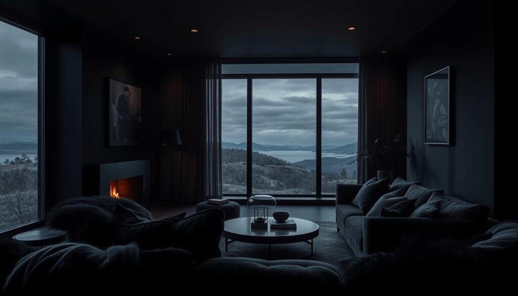
Contrary to popular belief, embracing shadowy tones needn’t shrink your rooms – it can redefine them. Design visionaries like Mark Sikes prove this with glossy black bathrooms that pull focus towards gleaming fixtures, while Fiona Lynch’s chocolate-brown bedrooms wrap occupants in cocooning elegance. The trick lies in treating depth as an ally rather than an enemy.
Creating Depth with Dark Hues
Strategic placement transforms intense pigments into spatial tools. Consider painting alcoves or recessed shelves in deep charcoal – these areas naturally recede, creating layered dimensions. A clever hack? Use the same shade on skirting and cornices to blur edges, making walls appear further apart.
Balance remains crucial. Pair inky features with light-reflecting surfaces like cream upholstery or marble side tables. In Michael Griffin’s projects, matte black panelling gains warmth from adjacent off-white walls, preventing heaviness. This interplay maintains airiness while introducing drama.
Three practical approaches work wonders:
- Apply dark tones to architectural details (fireplaces, window frames)
- Limit bold walls to one per room, ideally opposite natural light sources
- Introduce metallic accents in matching undertones (bronze for warmth, chrome for coolness)
As Fiona Lynch notes: “A restrained dark palette acts like eyeliner for interiors – it defines without overwhelming.” Test samples vertically at different times; dusk reveals how artificial lighting interacts with your chosen shade. Remember: confidence here rewards you with sophistication that pale walls alone can’t achieve.
Accent Walls and Colour Blocking Techniques
Strategic pigment placement transforms overlooked corners into design assets. When executed thoughtfully, these methods don’t shrink your space – they reveal its hidden potential. The trick lies in treating walls as collaborators rather than boundaries.

Highlighting Architectural Features
Accent walls work hardest when they celebrate your room’s bones. Picture a heritage cornice framed by warm terracotta, or window recesses dipped in sage-green to mimic garden views. These choices don’t shout – they whisper invitations to look closer.
Colour blocking guides the eye through clever contrasts. Try painting lower wall sections in deeper tones while keeping uppers light. This horizontal division lifts ceilings visually. In period properties, highlighting original panelling with muted olive adds heritage charm without heaviness.
Proportion matters. Limit bold statements to 20-30% of wall space. A forest-green alcove behind shelves creates depth, while matching the shade to upholstery threads ties the scheme together. For modern flats, try tonal stripes along chimney breasts to accentuate height.
Subtlety reigns supreme. A warm greige accent wall gains dimension when flanked by lighter variants. Notice how morning light shifts its appearance – that’s your palette working dynamically. As designer Fiona Howard observes: “The right accent doesn’t compete with your space – it conducts it.”
Remember: these techniques layer warmth into compact areas. Your eye skims across connected tones, perceiving expansiveness. It’s not about adding colour – it’s about choreographing attention.
Color Schemes That Make Small Apartments Look Spacious
Imagine stepping into a compact flat that feels instantly tranquil and expansive – the magic lies in nature-inspired palettes and tonal sophistication. These approaches don’t just decorate walls; they craft environments that breathe with intention.

Outdoor Inspired Neutrals
Earthy tones borrowed from landscapes create seamless transitions between indoors and out. A London flat’s recent transformation used sandy beige walls with oak flooring, mirroring dappled sunlight through sheer linen curtains. This approach blurs edges while maintaining definition – think stone-grey upholstery against warm wood accents.
Pairing organic materials enhances the effect. Try rattan lampshades alongside muted green throw pillows, echoing park views beyond your window. These choices work particularly well in rooms with limited natural light, as they borrow warmth from natural textures.
Modern Monochromes
Single-colour schemes gain depth through strategic variation. A Manchester studio achieved this with five shades of charcoal grey – lighter tones on walls, richer variants on skirting boards. The result? Architectural details pop while maintaining spatial flow.
Introduce contrast through finish rather than hue. Glossy wooden shelves against matte walls create subtle interest. For window treatments, match blinds to your dominant shade but in a lighter tint – this maintains cohesion without heaviness.
Three principles elevate monochromatic spaces:
- Use texture variation (brushed metal, nubby wool) to prevent flatness
- Anchor the scheme with one natural material like oak or slate
- Repeat your base colour in at least three rooms for continuity
As designer Fiona Howard notes: A restrained palette acts like a deep breath for compact homes – it calms while revealing hidden potential.
Whether through nature’s whispers or tonal precision, these approaches prove that thoughtful palettes transform spatial perception.
Inspiration from Expert Designers
Leading designers reveal how calculated pigment choices can reshape spatial narratives. Their approaches blend artistry with spatial psychology, offering blueprints for transforming confined areas. Let’s explore two masters’ methods that balance boldness with subtlety.
Heidi Caillier’s Sage and Navy Ideas
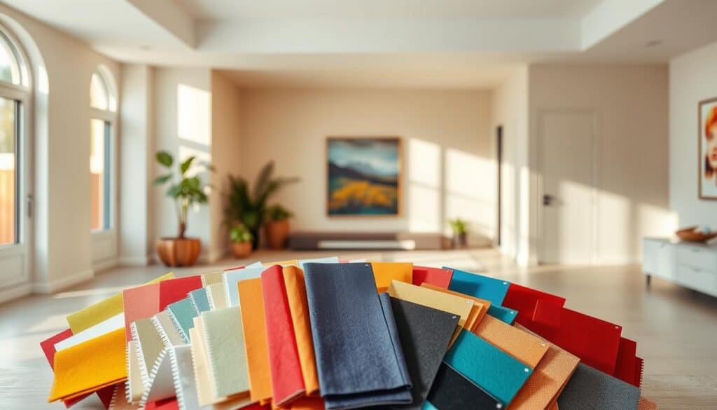
Caillier’s signature navy-and-cream combinations demonstrate dark hues’ transformative power. In a Bristol townhouse project, she paired deep blue panelling with warm stone walls, creating depth without heaviness. The secret? Matching undertones – her navy’s green base harmonises with aged brass fixtures and limestone floors.
Lisa Romerein’s Olive Green Inspiration
Romerein’s olive-green backdrops bring organic serenity to urban flats. Her Hackney studio scheme uses muted sage with terracotta accents, evoking Mediterranean landscapes. Notice how she selects yellow-based greens to complement honey-toned wood – a masterclass in undertone alignment.
Adapt these ideas through simple steps:
- Test swatches vertically at different daylight hours
- Pair bold walls with neutral furnishings in matching undertones
- Use sample pots to paint temporary “frames” around windows
Romerein advises: Let your space’s light quality guide your blue or green variations – north-facing rooms crave warmth, south-facing ones handle cooler bases.
Whether embracing Caillier’s dramatic contrasts or Romerein’s earthy whispers, thoughtful choices become your spatial allies.
Incorporating Natural Materials and Warm Accents
Natural materials whisper stories of craftsmanship into compact interiors, transforming sterility into sanctuary. Imagine walnut side tables catching afternoon light or a woven jute rug softening sleek flooring – these elements ground spaces without demanding attention. They’re not mere decor; they’re silent partners in spatial storytelling.

Wood Tones and Gold Accents
Wood’s organic irregularity adds tactile warmth to streamlined rooms. You’ll find that oak flooring grounds a monochrome scheme, while lighter ash shelves keep sightlines airy. For balance, pair richer timbers like teak with matte gold handles or picture frames – their muted gleam nods to luxury without shouting.
Neutral backdrops let these materials sing. A soft greige wall becomes a stage for cherrywood cabinets, their grain patterns turning functional storage into art. Designers often layer three wood tones maximum: one dominant, one accent, one for smaller decor items. This hierarchy prevents visual noise.
Gold accents work best when they echo other warm elements. Try brass pendant lights above a reclaimed pine dining table, or gilt-edged mirrors reflecting leafy greens from houseplants. As Fiona Howard advises: “Layering materials is like building a friendship – seek harmony, not competition.”
- Use rattan baskets to soften angular shelving units
- Introduce metallic textures through curtain rods or lamp bases
- Anchor bold greens in terracotta planters for earthy cohesion
These choices create depth that paint alone can’t achieve. Your eye dances between textures, perceiving expansiveness through curated detail. It’s not about filling space – it’s about enriching it.
Combining Pastel Shades for a Soft Ambience
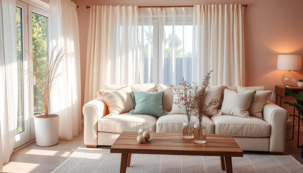
Soft hues whisper tranquillity into compact rooms, offering an antidote to urban bustle without sacrificing character. These gentle tones work particularly well in British flats, where natural light often plays hide-and-seek through sash windows. The magic lies in layered subtlety – think barely-there pinks that blush at dawn or misty blues echoing coastal skies.
Balancing Soft Pinks and Blues
Modern schemes thrive on nuanced pairings. A Farrow & Ball-inspired sitting room might combine Setting Plaster walls with Parma Gray woodwork, creating depth through tonal siblings rather than contrasts. This approach maintains airiness while adding sophistication – crucial in small space layouts where every shade choice matters.
Three principles ensure harmony:
- Anchor the scheme with one dominant pastel (try buttery yellow on north-facing walls)
- Introduce complementary tones through textiles and art
- Use matte finishes to prevent chalkiness in low light
Colour drenching – painting walls, trim and ceilings the same hue – gains freshness with pale greens like Mizzle. This technique blurs edges visually, making boxy rooms feel less constrained. Pair with natural linen curtains and bleached oak flooring for organic warmth.
When combining multiple pastels, mind their undertones. Dusty pinks with peachy bases harmonise with sage greens, while cooler lilacs suit minty accents. As one Farrow & Ball designer notes: “The right pale palette feels like a deep breath – it calms the eye while suggesting space.”
Remember: successful design balances trend-awareness with timelessness. Your small space deserves hues that adapt to changing light and moods, offering sanctuary today and tomorrow.
Balancing Multiple Colours in a Small Space
Mixing pigments in compact rooms feels risky until you discover the art of equilibrium. Designers achieve this through techniques like double drenching – wrapping walls, woodwork and ceilings in tonal variations – which maintains flow while adding nuance. The goal? A space feel that’s dynamic yet cohesive, where each hue knows its role.
Creating Visual Harmony
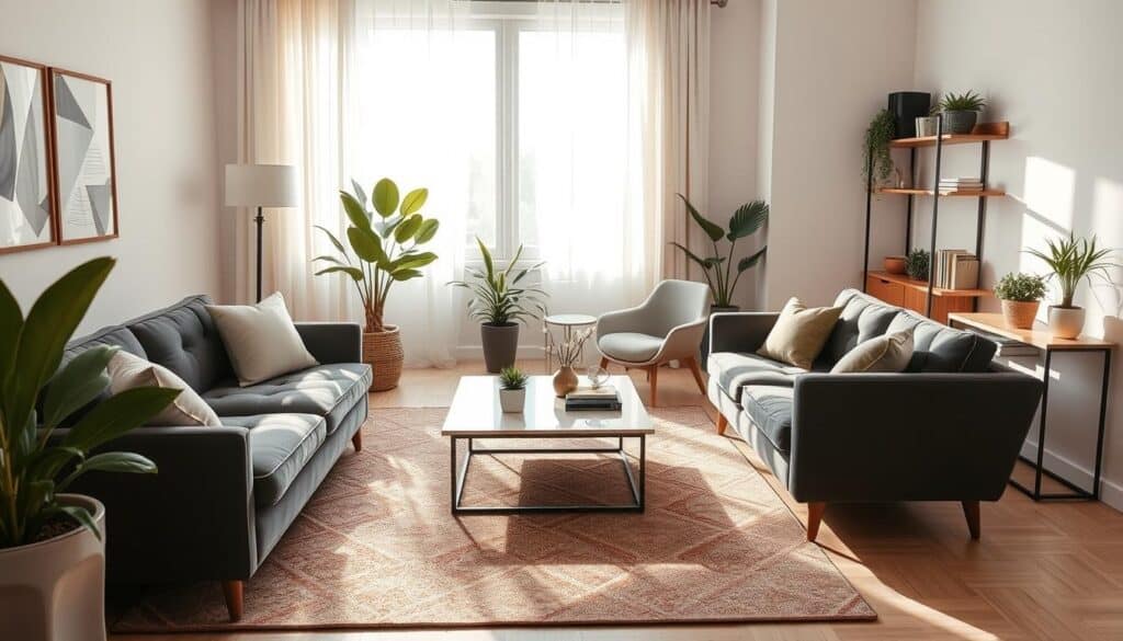
Start by choosing a dominant shade that occupies 60% of surfaces. Pair it with two supporting tones – one slightly lighter, another deeper. In a Bristol flat, soft putty walls were complemented by mushroom-grey upholstery and charcoal picture frames. This hierarchy prevents competition while adding depth.
Natural light dictates how pigments interact. North-facing rooms benefit from warm bases that prevent coldness. South-facing spaces can handle cooler accents. Always test combinations at different times – morning sun reveals different undertones than evening lamplight.
Avoiding Colour Overload
Limit your palette to three main hues plus neutrals. Use bright white on trim or ceilings to anchor bold choices. A Hackney studio successfully paired terracotta walls with pale oatmeal curtains, letting the white-painted fireplace surround act as a visual breather.
Three practical tips:
- Repeat your lightest shade in multiple rooms for continuity
- Use textiles to introduce secondary colours without commitment
- Paint temporary swatches larger than A4 to judge true impact
As designer Fiona Howard advises: “Treat your palette like a choir – every voice should harmonise, not shout.”
Whether through tonal layering or strategic contrasts, balance emerges when pigments collaborate rather than compete. Test, adjust, and let your space feel guide final choices.
The Role of Furniture and Decor in Enhancing Colour Schemes
Your sofa isn’t just seating – it’s a silent collaborator in your spatial narrative. When chosen thoughtfully, furnishings become extensions of your walls, reinforcing or softening their impact. This synergy transforms functional items into design allies that elevate your entire scheme.
Selecting Complementary Decor
Large pieces like armchairs or sideboards should converse with your walls. Pair soft white walls with linen upholstery in warmer ivory tones – the subtle contrast adds depth without conflict. For bold navy features, introduce walnut tables with reddish undertones to ground the intensity.
Metallic details work wonders when they echo existing elements. Brass lamp bases complement gold accents in artwork frames, creating continuity. In compact layouts, mirrored coffee tables reflect light while visually expanding boundaries – a clever trick to make room feel airier.
Three principles ensure harmony:
- Match wood finishes to wall undertones (oak with warm greys, ash with cool blues)
- Use rugs to anchor floating furniture arrangements
- Layer textures through woven baskets and velvet cushions
A Hackney flat demonstrates this balance: soft white walls gain warmth from terracotta planters, while gold accents in curtain rods tie the scheme together. As designer Fiona Howard notes: “The right side table can resolve a colour conversation that walls started.”
Remember – functional doesn’t mean bland. Choose storage ottomans in hues that make room palettes sing. Your choices should feel intentional, not accidental. When every piece contributes to the story, even modest spaces achieve polished cohesion.
Colour Trends for 2023 and Beyond
The palette of British interiors is quietly shifting, blending heritage sensibilities with fresh perspectives. This year’s trends reveal a thoughtful departure from stark minimalism, embracing hues that nurture both intimacy and perceived space. Leading designers like Sophie Robinson note: “We’re seeing a return to nature-infused tones that ground compact rooms without overwhelming them.”
Emerging Colours in UK Interiors
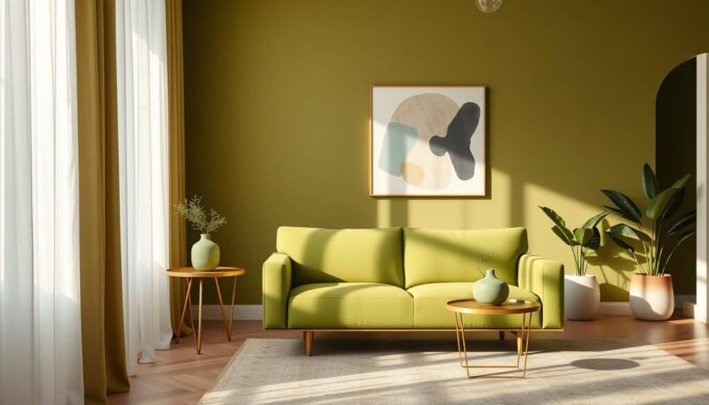
Olive green emerges as a quiet powerhouse in modest spaces. Its earthy undertones add warmth to north-facing rooms, pairing beautifully with natural materials like unvarnished oak or rattan. In a recent Dulux Colour Forecast study, 63% of designers favoured this adaptable shade for its ability to transition from traditional to contemporary settings.
Bolder choices are making waves too. Deep aubergine accents in alcoves create focal points, while terracotta-inspired neutrals offer a sun-kissed glow. These paint colour innovations reflect a broader cultural shift – our homes now demand versatility, serving as both sanctuaries and multifunctional hubs.
Three principles guide successful adoption:
- Use olive green as a unifying element across adjacent rooms
- Balance intense hues with matte finishes to prevent visual clutter
- Test emerging paint colours in sample pots before full commitment
As Farrow & Ball’s colour curator advises: “Trends should whisper, not shout – especially in compact layouts.”
Whether through a single statement wall or subtle textile accents, these directions prove that thoughtful updates can feel both current and enduring.
Tips for DIY Colour Selection and Application
Transforming your home’s atmosphere starts with thoughtful experimentation rather than guesswork. Begin by painting metre-square test patches on different walls, observing how morning and evening light shift their appearance. This simple step reveals undertones you’d miss on tiny swatches – crucial for making spaces feel harmonious.
Adopt gradual colour drenching if you’re hesitant about bold choices. Paint adjacent walls in progressively deeper tones of the same hue – say, from pale oat to warm terracotta. This layered approach maintains flow while adding depth, helping compact rooms feel more expansive without overwhelming.
- Use eggshell finishes to bounce light around north-facing rooms
- Test samples vertically – colours appear darker on walls than swatches
- Avoid high-gloss paints that create harsh reflections in tight spaces
Common pitfalls? Choosing shades solely under artificial lighting or neglecting existing furniture tones. Always assess test patches over 48 hours, noting how they harmonise with wood grains or metallic accents. For ceilings, consider a shade two tones lighter than walls to lift the space visually.
Practical creativity wins here. Mix sample pots to create custom hues, applying them to temporary MDF boards you can move between rooms. As one Dulux Colour Consultant advises: “Treat your home as a laboratory – discovery often happens through playful iteration.”
Remember: lighter, brighter finishes make rooms feel airy, while methodical testing helps avoid costly repaints. Your perfect palette lies where practicality meets personal expression.
Expert Advice on Layering Neutrals and Bold Shades
Mastering tonal relationships unlocks new dimensions in compact interiors. Design professionals increasingly champion the ‘double drench’ method – wrapping surfaces in gradient hues from the same family. This approach adds sophistication while maintaining spatial flow, particularly effective in British flats where light quality varies dramatically.
Using Two Tones to Create Depth
Farrow & Ball’s recent Chelsea project demonstrates the power of subtle variation. They paired School House White walls with Pointing trim – nearly identical off-whites differing by just 10% grey content. The result? Skirting boards appear to recede gently, creating layered perception without jarring contrasts.
Balance emerges through strategic distribution. Try using bolder shades on lower wall sections or built-in shelving, reserving lighter tones for upper areas. In a Bristol renovation, deep ochre alcoves gained warmth from adjacent buttermilk walls, proving that intensity needn’t overwhelm when thoughtfully contained.
Three principles guide successful execution:
- Limit your palette to two main hues with shared undertones
- Use eggshell finishes on darker areas to prevent flatness
- Repeat your lightest tone in soft furnishings for continuity
Texture plays a crucial supporting role. Matte walls gain dimension when paired with linen curtains or nubby wool throws. As designer Rita Konig advises: “The magic happens in the fourth layer – that barely-there shift in sheen or weave that makes neutrals sing.”
Test your combinations vertically across adjoining surfaces. What reads as a stark difference on swatches often softens into harmonious gradation when applied. Remember – successful layering feels discovered, not designed.
Small Living Room Colour Schemes: A Focal Point
Crafting the perfect atmosphere in a compact lounge requires balancing bold statements with spatial awareness. The right palette can turn limitations into opportunities, directing attention where it matters most. Here’s how innovative approaches redefine what’s possible.
Double Drenching for Consistency
This technique wraps walls, skirting and ceilings in tonal variations of one hue. A London townhouse recently used three taupe shades – lightest on ceilings, mid-tone on walls, deepest on trim. The result? Seamless flow that feels expansive yet intentional.
Key benefits emerge:
- Eliminates harsh contrasts that fracture sightlines
- Allows architectural details to shine through subtle gradation
- Works particularly well with warm neutrals or muted greens
Unexpected Twists with Purple and Red Accents
Strategic pops of intensity add personality without chaos. Consider an aubergine armchair against oatmeal walls, or fire-engine red cushions in a monochrome scheme. These choices work when anchored by neutrals – think 80% base tones to 20% drama.
A Manchester studio demonstrates this balance: deep plum shelving interiors play against pale grey walls, drawing the eye without overwhelming. The secret lies in repeating accent shades through smaller decor items like vases or artwork frames.
“Bold accents should feel discovered, not forced – like a secret your room chose to share.”
When executed thoughtfully, these methods prove that even modest spaces can command attention. The goal isn’t to disguise limitations, but to celebrate their potential through intelligent scheme design.
Final Thoughts on Maximising Space with Colour
Unlocking a room’s potential begins with understanding how pigments shape perception. Light-reflecting neutrals remain foundational, stretching boundaries while bold accents add purposeful drama. The magic lies in equilibrium – a harmony where walls converse with furnishings, and ceilings guide the eye upward.
Strategic techniques like double drenching or tonal layering prove transformative. These approaches create depth without clutter, particularly when aligning sofa fabrics with wall undertones. A well-chosen accent wall, meanwhile, directs attention to architectural strengths rather than spatial limits.
Three principles anchor success:
- Let natural light dictate undertone choices
- Repeat key hues across multiple surfaces for cohesion
- Use matte finishes on ceilings to soften reflections
Your furnishings play a crucial role. A neutral linen sofa gains character beside terracotta cushions, while metallic lamp bases echo warmer wood grains. These pairings ensure decor feels intentional, not accidental.
Remember: spatial enhancement thrives on thoughtful iteration. Test swatches vertically, observe how evening lamplight alters moods, and trust gradual adjustments. As designer Rita Konig wisely notes: “The most impactful interiors whisper their cleverness through subtlety.”
With these insights, even the cosiest flat can feel like a sanctuary that breathes. It’s not about disguising compactness – it’s celebrating its possibilities through informed choices.
Conclusion
The true measure of a home lies not in square metres, but in how thoughtfully you shape its atmosphere. Throughout this guide, designers have shown how light-reflecting hues and bold accents work in tandem to reimagine compact layouts. Their wisdom proves that restraint and daring can coexist – whether through layered neutrals or strategic depth.
A well-curated palette achieves more than visual expansion. It crafts environments where natural light dances across surfaces, where undertones harmonise with wood grains, and where furniture choices amplify spatial flow. The transformative effect emerges not from trends, but from understanding your space’s unique dialogue with pigment and texture.
Don’t shy from experimentation. Try that charcoal alcove you’ve been eyeing, or soften sunlit walls with greige undertones. Borrow techniques like the ‘double drench’ method from Heidi Caillier’s playbook, adapting them to your flat’s proportions. Remember: even subtle shifts in finish or tone can alter perceptions dramatically.
Ultimately, creating a balanced, inviting home requires trusting your instincts as much as expert principles. Let your choices celebrate architectural quirks rather than disguise them. With each brushstroke, you’re not just painting walls – you’re revealing hidden layers of spatial potential.
gCompact living needn’t mean compromise. Through intentional palettes and clever contrasts, even the cosiest flat becomes a personality-packed retreat that breathes with possibility. Your space awaits its next chapter – what story will your walls tell?